Understanding CSS Keyframes: A Comprehensive Guide

Written by
Sanjay Jyani
Front End Developer
Table of contents
Build with Radial Code
CSS keyframes are a powerful tool in web development, allowing developers to create animations and transitions that bring websites to life. They offer a powerful toolset for creating dynamic and engaging animations on the web. With the ability to define intermediate steps between styles, CSS Keyframes enable developers to craft fluid and expressive animations that enhance user experience. In this comprehensive guide, we will delve into the world of CSS keyframes, exploring their syntax, usage, and best practices. Whether you're a beginner looking to add some flair to your website or an experienced developer seeking to master animation techniques, this guide is for you. We will cover everything from syntax to practical examples, ensuring you have the knowledge and skills to create stunning animations for your web projects.
What are CSS Keyframes ?
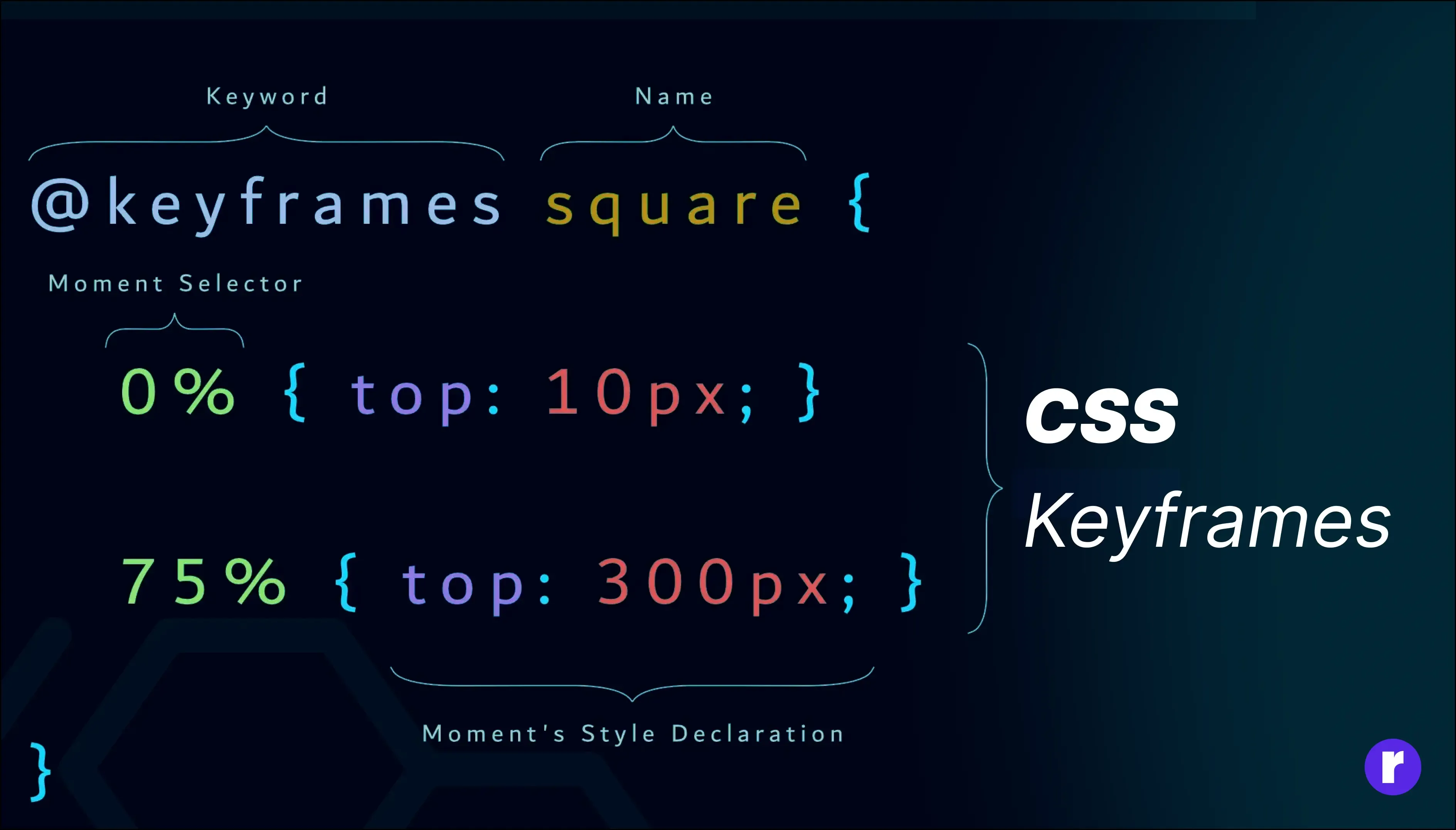
CSS Keyframes serve as the backbone of captivating web animations, offering developers a robust toolkit to breathe life into their designs. These keyframes define the progression of styles for an element throughout an animation sequence, enabling seamless transitions and dynamic effects. By specifying intermediate steps between different states of an element, CSS Keyframes facilitate the creation of engaging animations that captivate users' attention and enhance overall user experience on websites. Whether it's a subtle fade-in effect or a complex series of transformations, CSS Keyframes empower developers to infuse their web projects with visual flair and interactivity, elevating them from static designs to dynamic experiences.
Syntax of CSS Keyframes
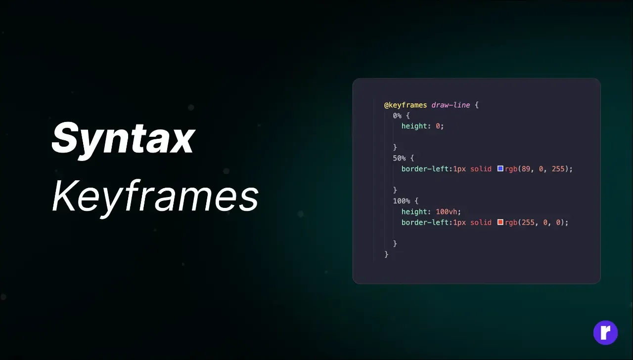
Mastering the syntax of CSS Keyframes is essential for unleashing the full potential of web animations.
The syntax follows a structured format, beginning with the @keyframes rule, which signifies the initiation of a keyframes animation sequence. This rule is followed by a user-defined name for the animation, providing a reference point for applying the animation to elements within the CSS stylesheet. Within the @keyframes rule block, developers define a series of keyframes by specifying percentages or specific time intervals (ranging from 0% to 100%). Each keyframe delineates the styles of the targeted element at that particular point in the animation. By strategically manipulating these keyframes, developers can orchestrate intricate animations that seamlessly transition between different states and evoke desired visual effects.
Finally, once the keyframes are defined, they can be applied to elements using the animation property in CSS, allowing developers to control various parameters such as duration, timing function, and iteration count, thereby fine-tuning the animation to suit specific design requirements.
CSS File
@keyframes animationName {
    0% {
           /* Initial CSS properties */
      }
     50% {
            /* Intermediate CSS properties */
      }
     100% {
            /* Final CSS properties */
      }
    }
The From keyword is equivalent to 0%, and the to keyword is equivalent to 100%. The animation will still behave the same way, transitioning from the initial state defined in from to the final state defined in to.
@keyframes animationName {
    from {
        /* Initial CSS properties */
    }

    to {
        /* Final CSS properties */
    }
}
Defining Keyframes
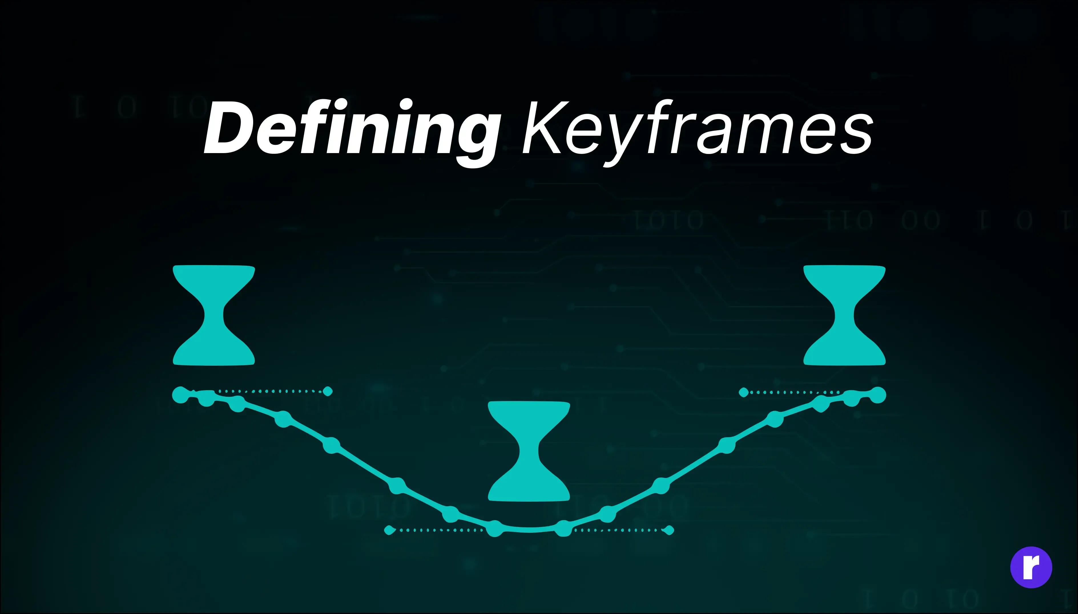
The @keyframes rule in CSS serves as a powerful tool for defining intricate animations with precise control over element transformations. Let's break down the rotate keyframes animation:
@keyframes rotate{
    0%{
        transform: rotate(0deg);
    }
    100%{
        transform: rotate(360deg);
    }
}
At 0%, the animation starts with the element in its initial state, defined by the transform property as rotate(0deg). This means the element is not rotated at all, maintaining its default orientation.
As the animation progresses to 100%, the transform property instructs the element to rotate a full 360 degrees clockwise (rotate(360deg)), completing one full rotation.
By defining these keyframes, we create a smooth transition for the element, gradually rotating it from its initial position to a full circle. This animation can be applied to various elements, adding dynamic visual effects and enhancing the overall user experience on web page
Applying Keyframes to Elements

Applying CSS Keyframes to elements is a straightforward process that adds dynamism and engagement to web interfaces. Once the keyframes are defined, they can be easily integrated into HTML elements using CSS properties.
Defining and Applying Keyframes
To apply keyframes to an element, start by defining the animation properties within the element's CSS styling. The animation-name property specifies the name of the keyframes animation to be applied. For instance:
.keyframe-animation {
    animation-name: rotate;
}
In this example, the rotate animation, defined elsewhere using @keyframes, will be applied to the .keyframe-animation element.
Setting Animation Duration
You can set the duration of the animation using the animation-duration property:
.keyframe-animation {
    animation-duration: 5s; /* Animation lasts for 5 seconds */
}
This sets the duration of the animation to 5 seconds.
Adjusting the Timing Function
You can adjust the timing function with the animation-timing-function property to control the speed curve of the animation:
.keyframe-animation {
    animation-timing-function: linear; /* Smooth start and end */
}
This determines how the animation progresses over time, ensuring a smooth and consistent animation speed.
Adding a Delay
To introduce a delay before the animation starts, use the animation-delay property:
.keyframe-animation {
    animation-delay: 1s;
}
This sets a 1-second delay before the animation begins.
Defining Animation Direction
You can control the direction in which the animation plays using the animation-direction property. This property allows you to reverse the animation or alternate between forward and backward directions:
.keyframe-animation {
    animation-direction: alternate;
}
In this example, the animation alternates between playing forward and backward with each iteration.
Stopping the Animation
If you want to stop the animation at a certain point, you can define this within your @keyframes. For example, to stop the animation at the last frame:
@keyframes rotate {
    0% { transform: rotate(0deg); }
    100% { transform: rotate(360deg); }
}

.keyframe-animation {
    animation-name: rotate;
    animation-duration: 2s;
    animation-iteration-count: 1;
}
In this setup, the animation rotates the element once and then stops at the last frame due to the animation-fill-mode: forwards; property, which keeps the element in its final state.
Full Example
Here’s how all these properties can be combined:
.keyframe-animation {
    animation-name: rotate;
    animation-duration: 2s;
    animation-iteration-count: infinite;
    animation-delay: 1s;
    animation-timing-function: linear;
    animation-direction: alternate;
}
In this example, the animation will start after a 1-second delay, last for 2 seconds, repeat infinitely, and alternate between forward and reverse directions, ensuring smooth transitions throughout.
By combining these animation properties, you can seamlessly integrate CSS Keyframes into HTML elements, enriching your web content with fluid and engaging animations that enhance the overall user experience.
Animation Properties
|
animation-direction |
Defines whether the animation should play forwards, backward, or alternate between forwards and backward on each cycle. Options include normal, reverse, alternate, and alternate-reverse. |
|
animation-fill-mode |
Specifies how the element styles are applied before and after the animation. Options include none, forwards, backwards, both, and initial. This property determines whether the element retains its initial styles or applies the styles defined in the first or last keyframe before and after the animation. |
|
animation-play-state |
Controls whether the animation is running or paused. This property can be set to running or paused to start or stop the animation dynamically. |
|
animation-composition |
A keyframe animation composition involves defining a sequence of keyframes for an element or multiple elements. For instance, animating a ball moving from left to right across the screen can be achieved by setting the initial and final keyframes of the ball's position. |
|
animation-range |
The range refers to the span of frames or time over which the animation occurs. In our example, if the animation is set to run from frame 0 to frame 60, the range is 60 frames. |
|
animation-timeline |
The timeline is a visual representation of the frames in your animation and the keyframes within those frames. It helps animators see where keyframes are placed and how elements change over time. |
Easing Functions
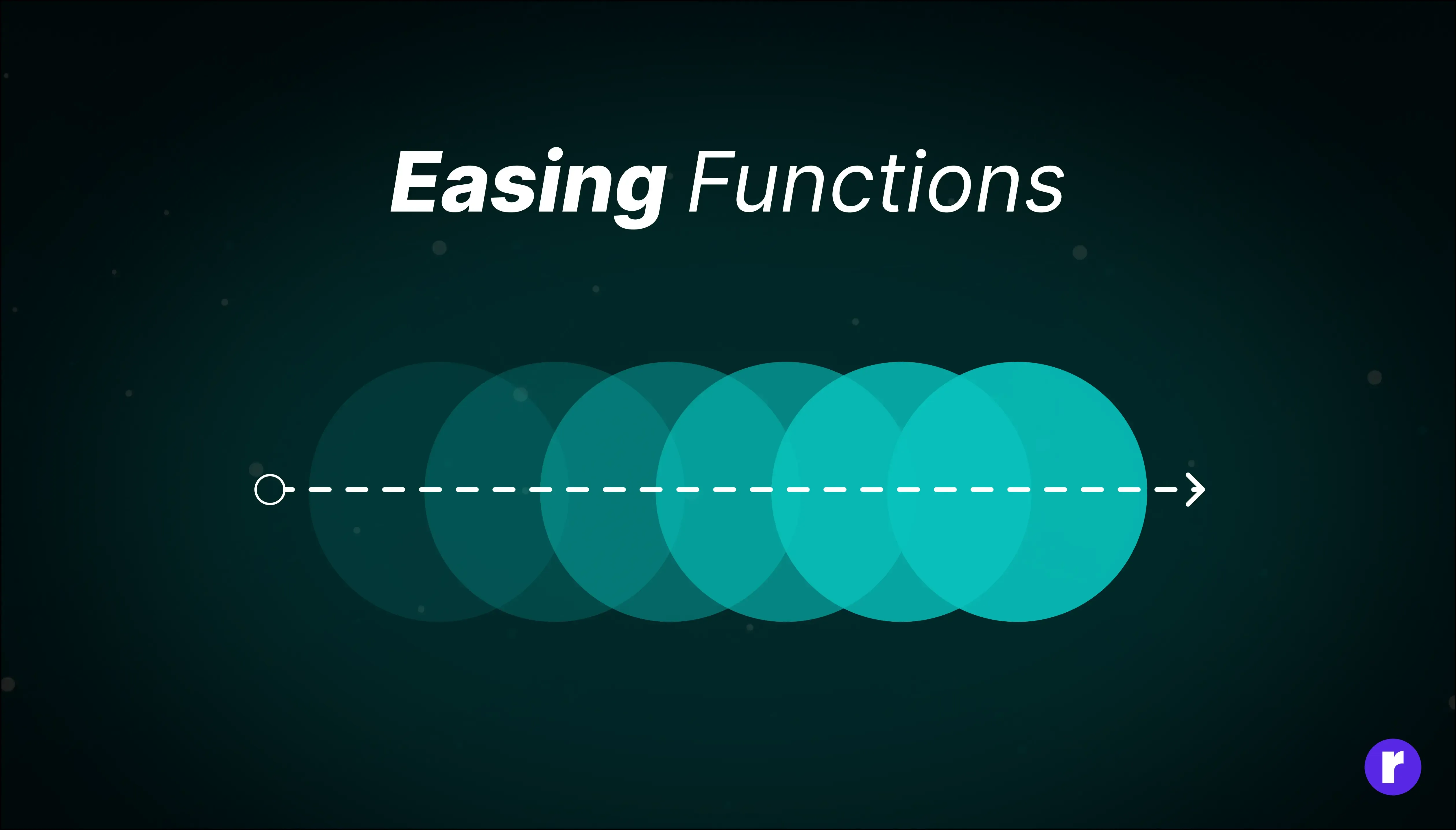
Easing functions play a pivotal role in shaping the behavior and visual appeal of CSS keyframe animations. They control the rate of change over time, dictating the acceleration and deceleration of movements, and thus create more natural and polished animations.
For example, the ease-in function starts an animation slowly and accelerates as it progresses, resulting in a smooth transition at the beginning. Conversely, ease-out decelerates the animation towards the end, creating a slowing-down effect as it finishes. The ease-in-out function combines both behaviors, starting and ending slowly with acceleration in the middle. A lineareasing function maintains a constant speed throughout the animation, without any acceleration or deceleration.
Customizing Easing with cubic-bezier
For more control over the animation’s timing, you can define a custom easing function using the cubic-bezier function. The cubic-bezier function allows you to create a custom curve by specifying four values that define the shape of the curve.
The syntax for cubic-bezier looks like this:
animation-timing-function: cubic-bezier(x1, y1, x2, y2);- x1, y1: These values control the start of the curve.
- x2, y2: These values control the end of the curve.
The coordinates (x1, y1) and (x2, y2) determine how the animation progresses from start to finish.
- x1, x2: These values must be between 0 and 1, representing the percentage of time along the animation's duration.
- y1, y2: These values can be any number and represent the easing at those points.
For example, a common cubic-bezier function is cubic-bezier(0.42, 0, 0.58, 1), which mimics the ease-in-out function:
.keyframe-animation {
    animation-timing-function: cubic-bezier(0.42, 0, 0.58, 1);
}
This curve starts and ends slowly, with acceleration in the middle, just like ease-in-out. By adjusting the values, you can create completely unique easing effects tailored to your design needs.
By applying the appropriate easing function to each keyframe or segment of the animation, developers can achieve nuanced effects that mimic real-world motion. This careful selection enhances the timing and movement of animations, resulting in a more engaging and visually pleasing experience for users.
Practical Examples
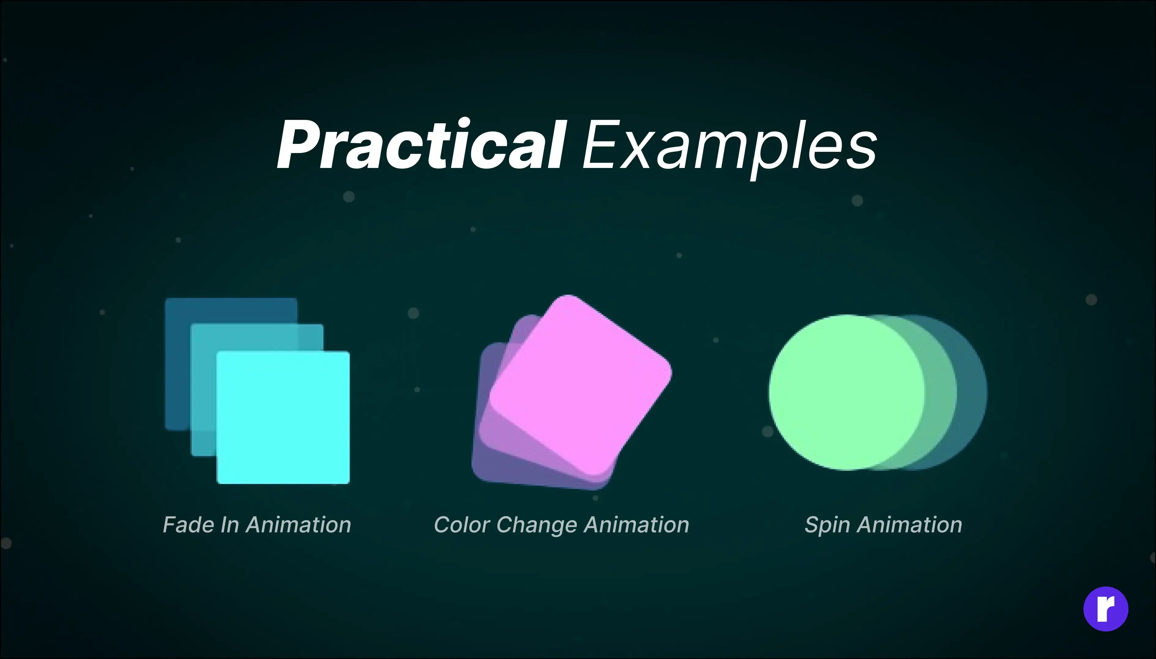
Let's explore some practical examples of CSS keyframe animations:
Example 1: Fade In Animation
This animation gradually fades in an element from transparent to fully opaque.
.element{
    animation-name: fadeIn;
    animation-duration: 2s;
}
@keyframes fadeIn {
 from {
  opacity:0;
 }
 to {
    opacity:1;
 }
}
Example 2: Color Change Animation
This animation smoothly transitions the color of an element from one color to another.
.element {
    animation-name: change-background;
    animation-timing-function: ease-in-out;
    animation-duration: 2s;
}
@keyframes change-background {
 0% {
  background: pink;
 }
 50% {
  background: ornage;
 }
 100% {
  background: green;
 }
}
Example 3: Spin Animation
This animation rotates an element continuously in a clockwise direction.
.element {
    animation-name: spin;
    animation-duration: 2s;
    animation-iteration-count: infinite;
    animation-timing-function: linear
}

@keyframes spin {
 0% {
  transform:rotate(0deg);
 }
 100% {
    transform:rotate(360deg);
 }
}
Browser Compatibility

Certainly! Ensuring browser compatibility is crucial when using CSS keyframes to create animations. While keyframes are widely supported in modern browsers, it's essential to verify compatibility, especially for older browser versions. Here's a breakdown of compatibility considerations:
|
Internet Explorer |
Keyframe animations are supported in Internet Explorer 10 and later versions. However, some older versions of Internet Explorer may have limited or partial support for CSS keyframes. |
|
Edge |
Microsoft Edge fully supports CSS keyframe animations in its modern versions. |
|
Firefox |
Keyframes are well-supported in Mozilla Firefox, including older versions. |
|
Chrome |
Google Chrome has excellent support for CSS keyframe animations across its versions. |
|
Safari |
Keyframes are supported in Safari, including on iOS devices. However, it's essential to test on Safari, as occasional issues may arise, particularly in older versions. |
|
Opera |
Opera supports CSS keyframe animations in its modern versions. |
|
Mobile Browsers |
Keyframe animations generally work well on mobile browsers, including Safari on iOS and Chrome on Android. However, performance considerations may vary, so thorough testing is recommended. |
By considering these compatibility factors and testing your animations across various browsers and versions, you can ensure a smooth and consistent experience for all users, regardless of their chosen browser.
Conclusion
CSS Keyframes offer developers a powerful means of enriching web interfaces with dynamic animations, fostering enhanced user engagement and interaction. This guide has equipped developers with a comprehensive understanding of keyframe syntax, properties, and best practices, enabling them to confidently implement captivating animations that elevate the user experience. With this knowledge at their disposal, developers are empowered to unleash their creativity, seamlessly integrating animations into their projects to create immersive and visually compelling web experiences. For more insights and expertise, visit at RadialCode .
