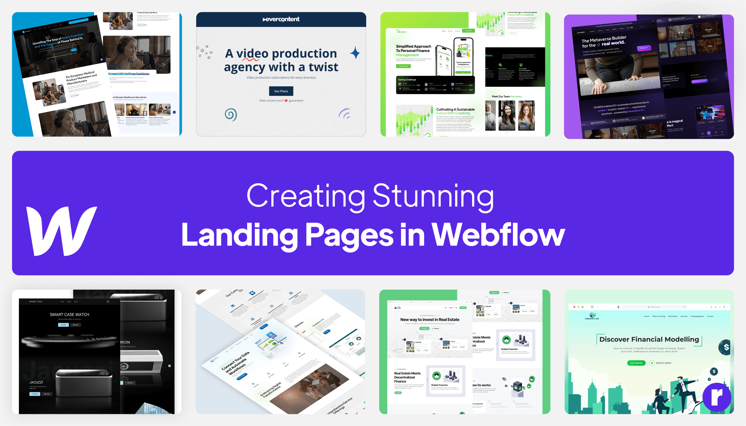
7 Tips and Tricks: Creating Stunning Landing Pages in Webflow

Written by
Sumit Sharma
Software Engineer & Solutions Architect
Ravi Sehrawat
Lead CMS Developer
Table of contents
Build with Radial Code
Creating a landing page that not only looks good but also converts can be a challenging task. However, with Webflow, you can design and develop at the same time, making the process much more efficient. Here are some tips and tricks to help you create stunning landing pages in Webflow.
Understand Your Target Audience
Before you start designing your landing page, it's important to have a clear goal in mind. What action do you want visitors to take when they land on your page? It's essential to understand your target audience. What are their preferences, expectations, and needs? Conduct detailed research to understand their demographics, interests, and challenges. This information will guide your design decisions and help you create a landing page that resonates with your audience.

Creating an Engaging Headline
The headline serves as the initial point of contact for visitors when they arrive on your page, making it crucial to capture their attention and encourage them to continue reading. Utilize impactful language and phrases that directly address your audience's needs or aspirations. An engaging headline not only piques their interest but also establishes the overall tone and expectations for your landing page.

Keep It Simple and Intuitive
When designing a landing page, simplicity is key. A cluttered and confusing layout will only distract and frustrate your visitors. Opt for a clean and minimalistic design that guides users' attention to the most important elements on the page, such as your call-to-action. Use white space strategically to create a sense of balance and increase readability. Remember, less is more!

Utilize Eye-Catching Visuals
Visuals are important for getting users' attention and communicating your brand message well. Choose high-quality images, illustrations, or videos that align with your brand identity and resonate with your target audience. Use contrasting colors and bold typography to make your landing page visually striking. Additionally, consider incorporating animations or interactive elements to create a memorable user experience.

Optimize for Mobile Devices
With the increasing use of mobile devices, it's crucial to ensure your landing page is optimized for mobile viewing. Webflow offers responsive design features that allow you to create a seamless experience across different screen sizes. Test your landing page on various devices to ensure it looks and functions flawlessly on mobile. This will not only improve user experience but also contribute to your SEO rankings.

Leverage Webflow's Interactions and Animations
Webflow provides a wide range of interactions and animations that can add flair and interactivity to your landing page. Utilize these features strategically to guide users through your content, highlight important elements, and create a memorable browsing experience. However, be mindful not to overdo it – moderation is key to maintaining a professional and polished appearance

Optimize Page Speed for Better User Experience
Page speed is a critical factor in determining user experience and search engine rankings. Slow-loading landing pages can lead to high bounce rates and lower conversions. To optimize page speed, compress images, minify CSS and JavaScript files, and leverage browser caching. Additionally, consider using lazy loading to load images only when they come into view, reducing initial load time.

Final words
Finally, don't forget to test your landing page and make improvements based on your findings. Webflow's built-in A/B testing tools can help you with this. A/B testing allows you to compare different versions of your landing page and determine which one yields better results. Test variations in headlines, layouts, colors, call-to-action buttons, or any other element that could impact conversion rates.
By following these tips and tricks, you'll be well on your way to creating a stunning landing page in Webflow that not only looks good but also converts.
