cross icon
DesignThe Rise of Dark Mode: Best Practices for Designing in the Dark

The Rise of Dark Mode: Best Practices for Designing in the Dark

6 mins Read
mainImg

Build with Radial Code

Radial Code Enterprise gives you the power to create, deploy and manage sites collaboratively at scale while you focus on your business. See all services.

In recent years, dark mode has become a ubiquitous feature across apps, operating systems, and web design. Its popularity is not just a passing trend; it's a response to the increasing screen time in our daily lives and the need for more comfortable viewing experiences. In this blog, we'll explore why dark mode is on the rise and share some best practices for designing in the dark.

“In 2024, nearly 82% of smartphone users preferred dark mode"
earthweb.com

What is Dark Mode?

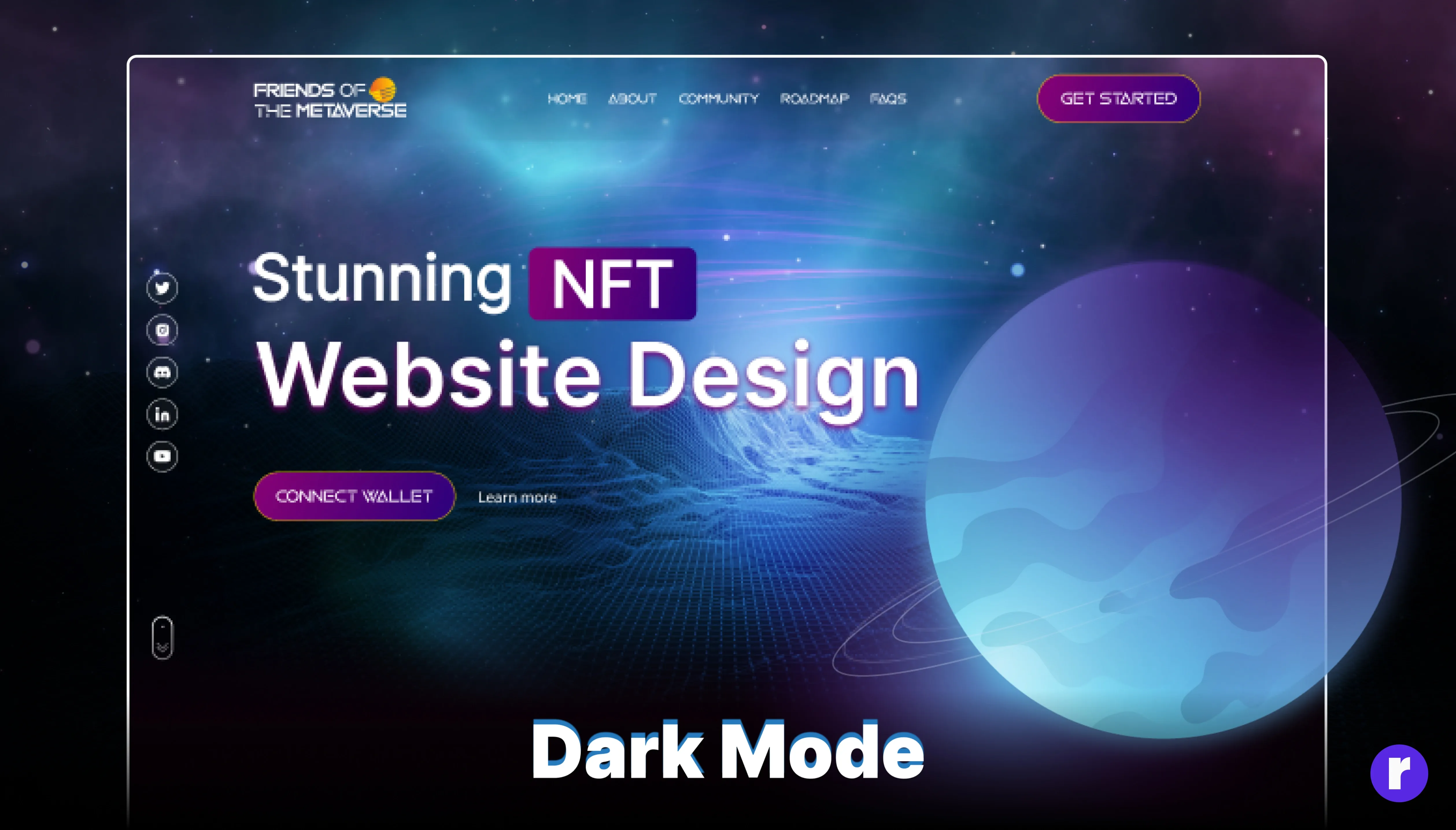
Dark Mode is a user interface (UI) option that uses a dark color palette instead of the traditional light backgrounds. It inverts the usual color scheme, presenting light-colored typography, icons, and UI elements against a dark background. You've likely encountered this feature on various apps, operating systems, and websites.

Why dark mode is important?

Dark mode design is important for several reasons, According to Harvard Health Publishing, dark mode can reduce eye strain in low-light conditions and decrease blue light exposure, which helps prevent sleep disruption.

Google highlights that dark mode can save battery life on OLED screens, as dark pixels consume less power. User preference is also a significant factor, with 81.9% of respondents in an Android Authority survey favoring dark mode.

Additionally, the American Academy of Ophthalmology notes that dark mode can enhance readability for users with visual impairments or light sensitivity. These benefits underscore the importance of incorporating dark mode design in applications and websites.

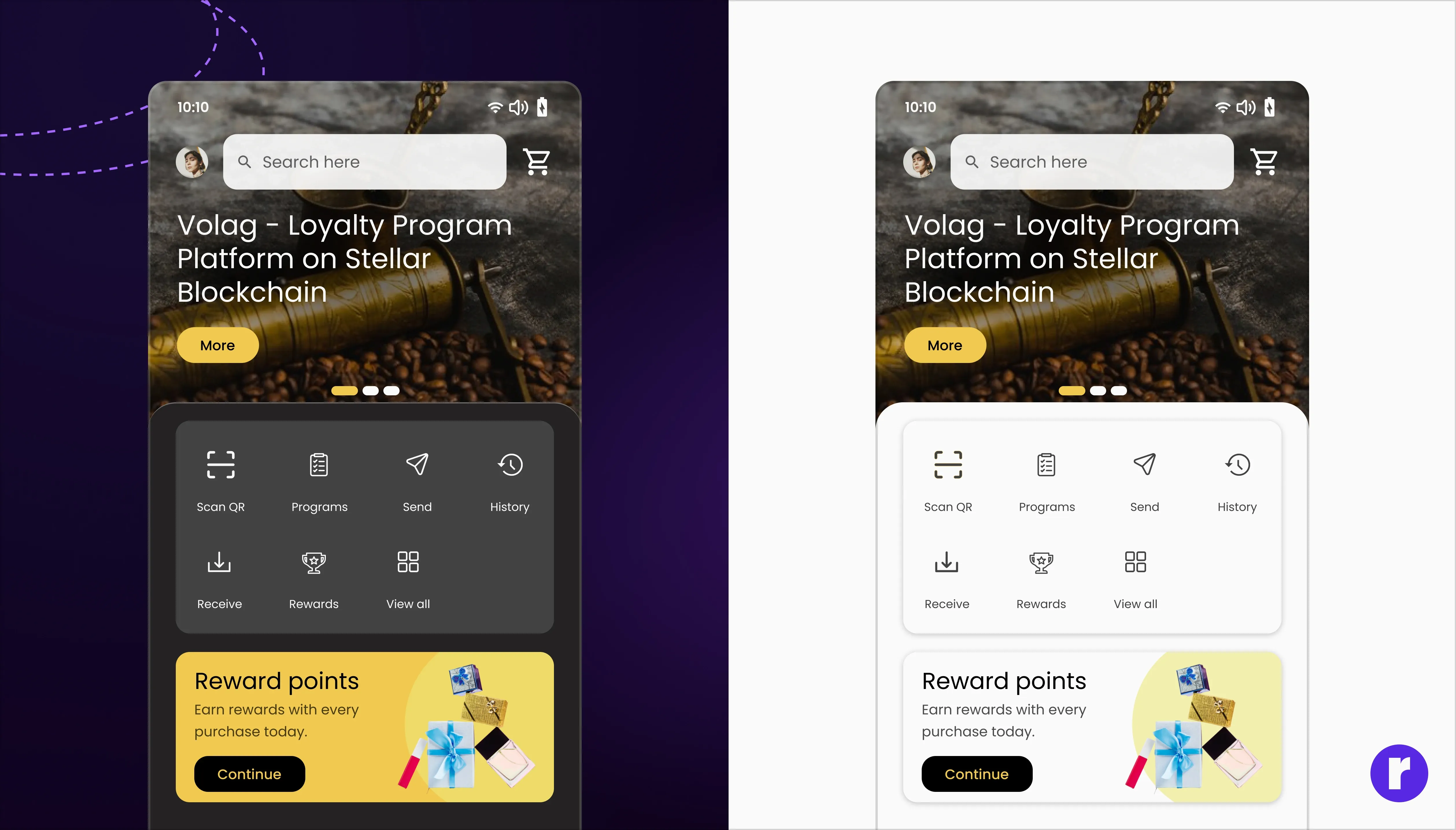
Apart from these, you can also see the designs created by us in dark mode. here
Understanding the Appeal of Dark Mode

Dark mode inverts the traditional light-background interface to a dark one, which can be easier on the eyes, especially in low-light conditions. It's said to reduce eye strain, save battery life on OLED and AMOLED screens , and even improve accessibility for users with certain visual impairments.

The Benefits:-

  • Reduces Eye Strain: Dark mode reduces the amount of bright white light emitted by screens, which can decrease eye fatigue.
  • Saves Battery Life: On certain screens, displaying darker pixels requires less power than lighter ones.
  • Visual Comfort: Many users find dark mode more visually appealing, especially when using devices at night or in dim environments.
  • Contrast Ratios: Ensuring text remains readable against dark backgrounds requires careful consideration of contrast ratios.
  • Color Saturation: Colors behave differently against dark backgrounds, and what worked in Light Mode might not translate well in Dark Mode.
  • Presence of True Blacks: Pure black backgrounds can lead to "halation," where light text appears to blur, making readability a concern.
User Preference and Accessibility

One of the most crucial elements in the rise of Dark Mode is user control. Allowing users to choose between light and dark themes caters to individual preferences and accessibility needs. Some people might find dark themes easier on the eyes due to vision impairments or sensitivity to light.

The Future of Dark Mode Design

What started as a niche feature for power users has become a standard design system component. Moving forward, we can expect Dark Mode to evolve alongside advancements in display technology and increased awareness of digital wellness.

Dark Mode isn't just a fad – it's a response to the changing needs and preferences of modern technology users. Its ascendency into the mainstream reflects a broader understanding among designers that comfort, personalization, and accessibility are paramount in creating user-centric experiences. As the digital world expands, Dark Mode will undoubtedly continue to shine brightly (or should we say dimly?) as a preferred choice for many.

Best Practices for Designing in Dark Mode

Crafting a dark mode experience transcends mere color inversion. It involves meticulous adjustments to contrast, hues, and saturation to ensure readability and visual comfort.

1. Maintain Contrast and Readability

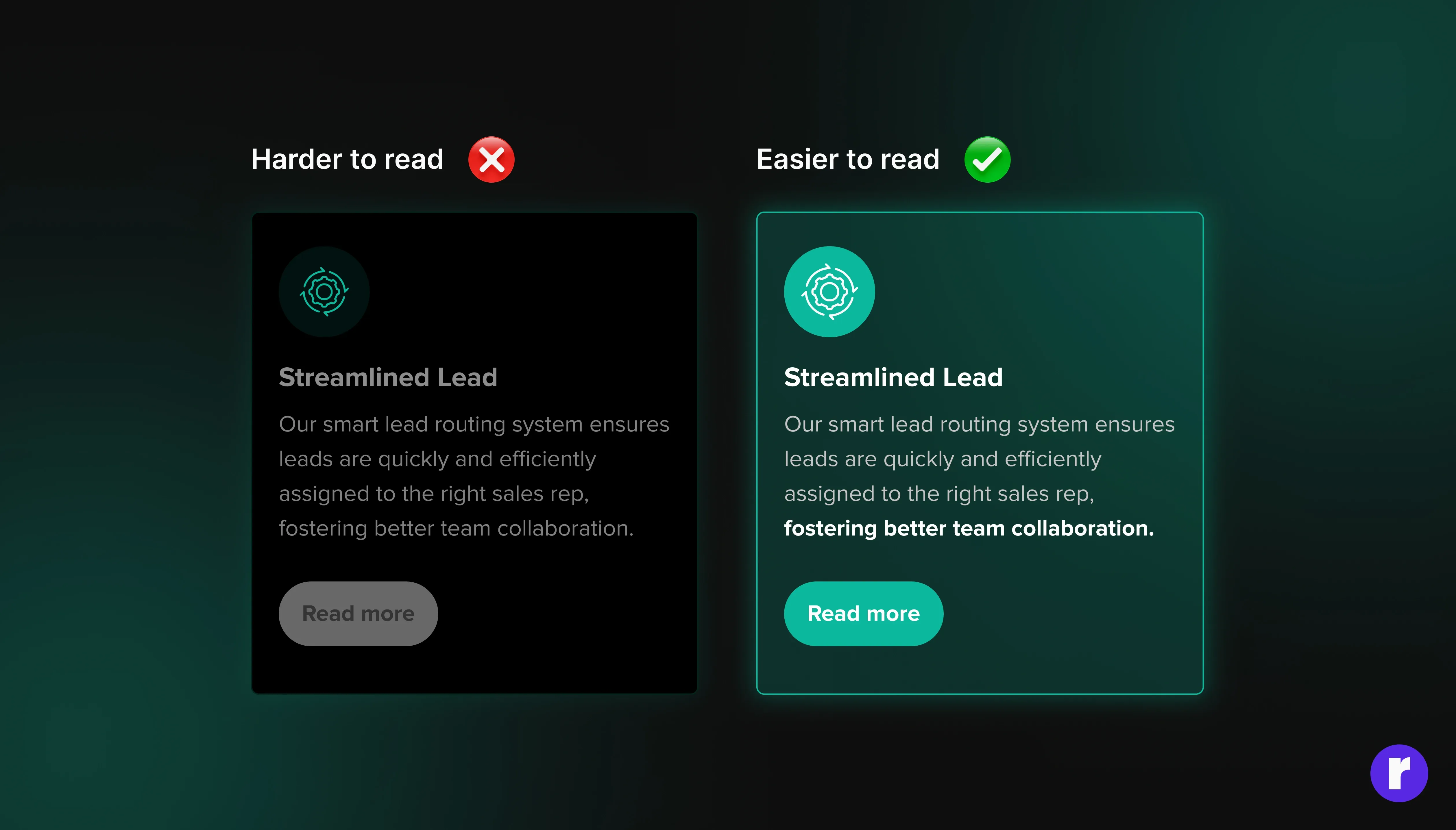
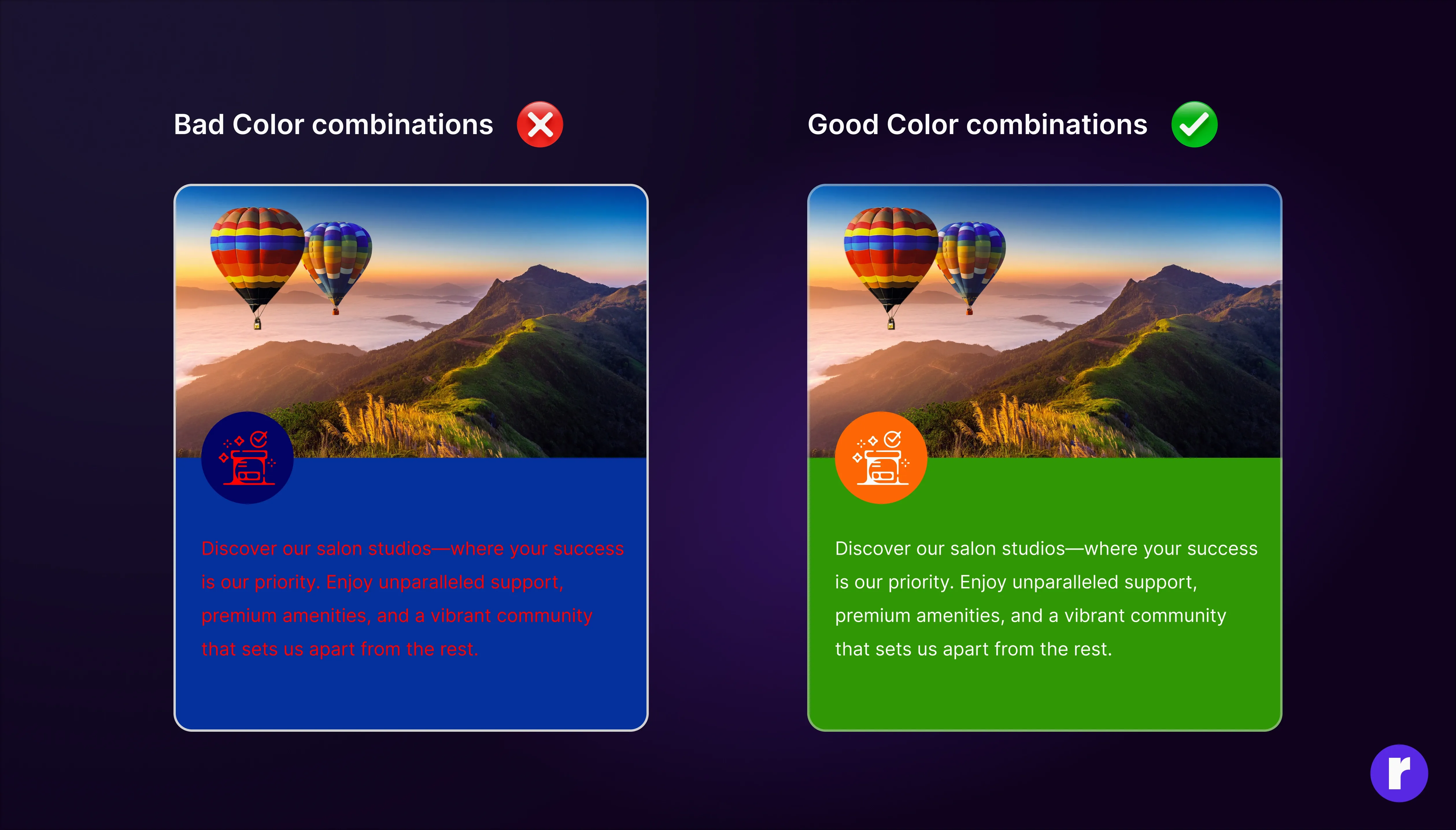
While dark mode reduces brightness, it's essential to maintain enough contrast between text and background to ensure readability. Use lighter shades for text and darker shades for backgrounds, but avoid pure white on pure black as it can create a harsh contrast.

2. Use Desaturated Colors

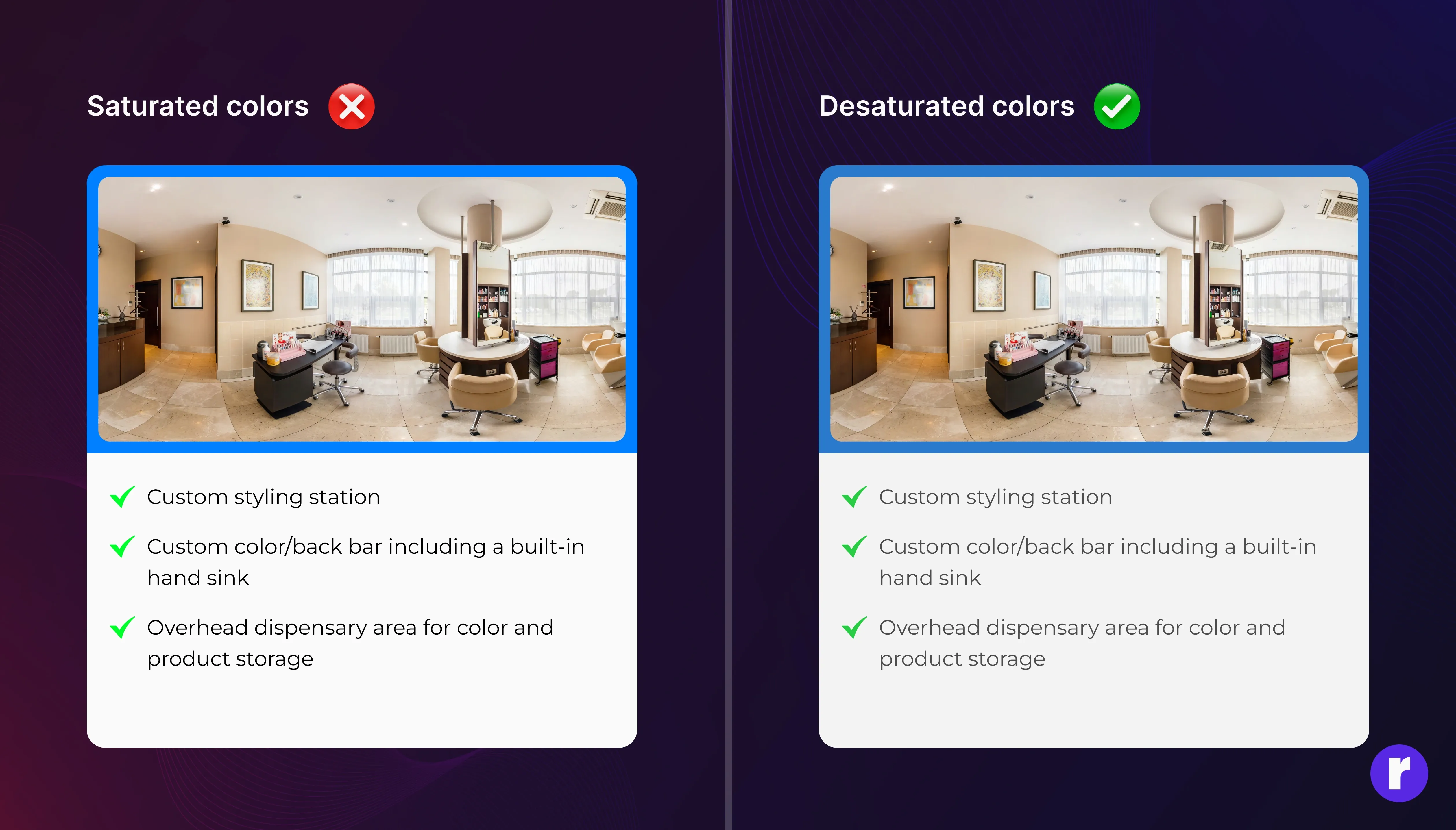
Bright, saturated colors can be jarring against a dark background. Instead, use desaturated colors that are easier on the eyes while still providing visual interest and hierarchy.

3. Embrace Shadows and Depth

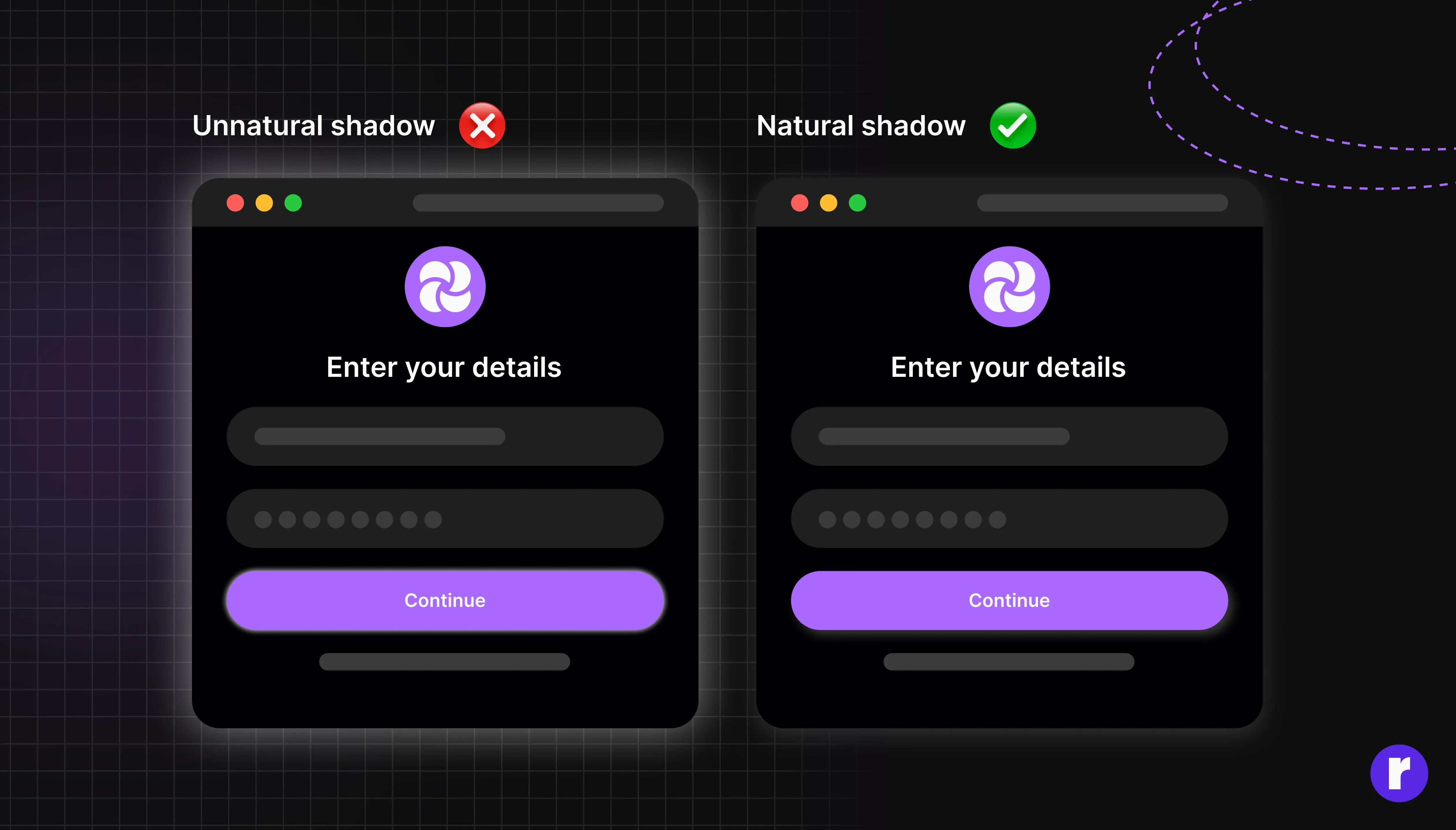
Shadows can help elements stand out in dark mode. Use subtle shadows to provide depth and elevate interactive elements like buttons and cards.

4. Test for Accessibility

Accessibility is crucial, so test your designs for color blindness and other visual impairments. Tools like WebAIM's Contrast Checker and Stark- Contrast & Accessibility Checker can help you ensure that your color combinations are accessible.

5. Provide User Choice

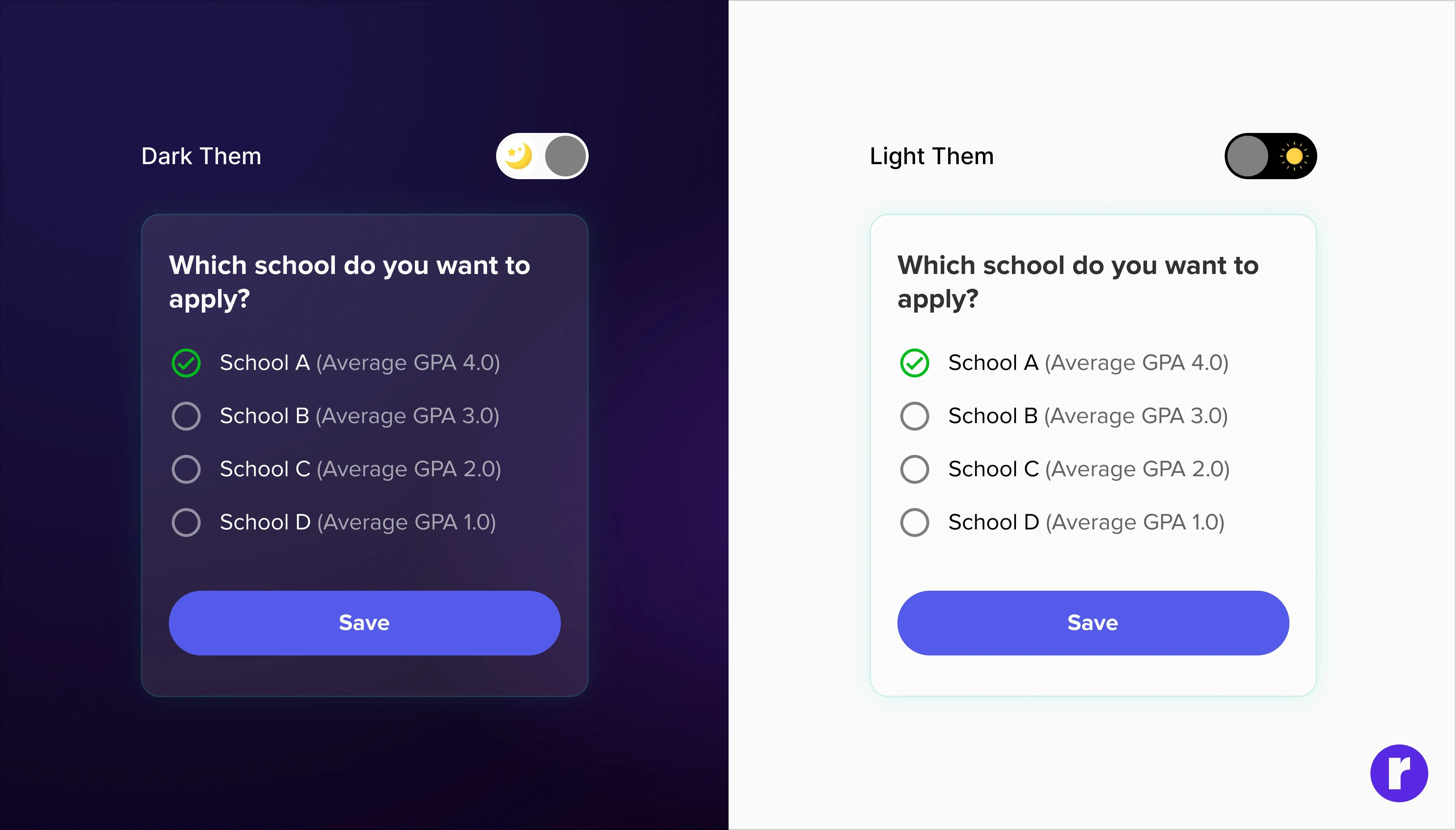
Not everyone prefers dark mode, so it's important to give users the option to switch between light and dark themes. Make the toggle easily accessible and remember user preferences for future visits.

6. Adapt Images and Icons

Images and icons may need adjustments for dark mode. Consider adding a semi-transparent overlay to images to integrate them smoothly into the dark theme, and ensure icons have enough contrast to be distinguishable.

7. Be Mindful of Branding

Your brand's identity should remain consistent across both light and dark modes. Adapt your color palette to work in both contexts without losing the essence of your brand.

Conclusion

The rise of dark mode reflects a growing demand for user-centric design choices that prioritize comfort and personalization. By following these best practices, designers can create dark mode experiences that are not only stylish but also functional and inclusive. As we continue to spend more time with our devices, dark mode will likely become an even more critical component of digital design.

CTA

Share this

whatsapp
whatsapp
whatsapp
whatsapp
whatsapp

Keep Reading

Stay up to date with all news & articles.

Email address

Copyright @2024. All rights reserved | Radial Code