The Soft Touch: Exploring the Neumorphism Trend in UI Design

Written by
Shweta Kumari
UI/UX Designer
Ashu Sirswa
UI/UX Designer
Table of contents
Build with Radial Code
Neumorphism, also sometimes called Neomorphism, has taken the UI design world by storm. This unique style offers a refreshingly soft and dimensional take on the minimalist flat design that dominated for years. But what exactly is neumorphism, and why has it captured the attention of designers? Let's delve deeper into this trend, exploring its origins, visual characteristics, benefits, and practical considerations for incorporating it into your own projects.
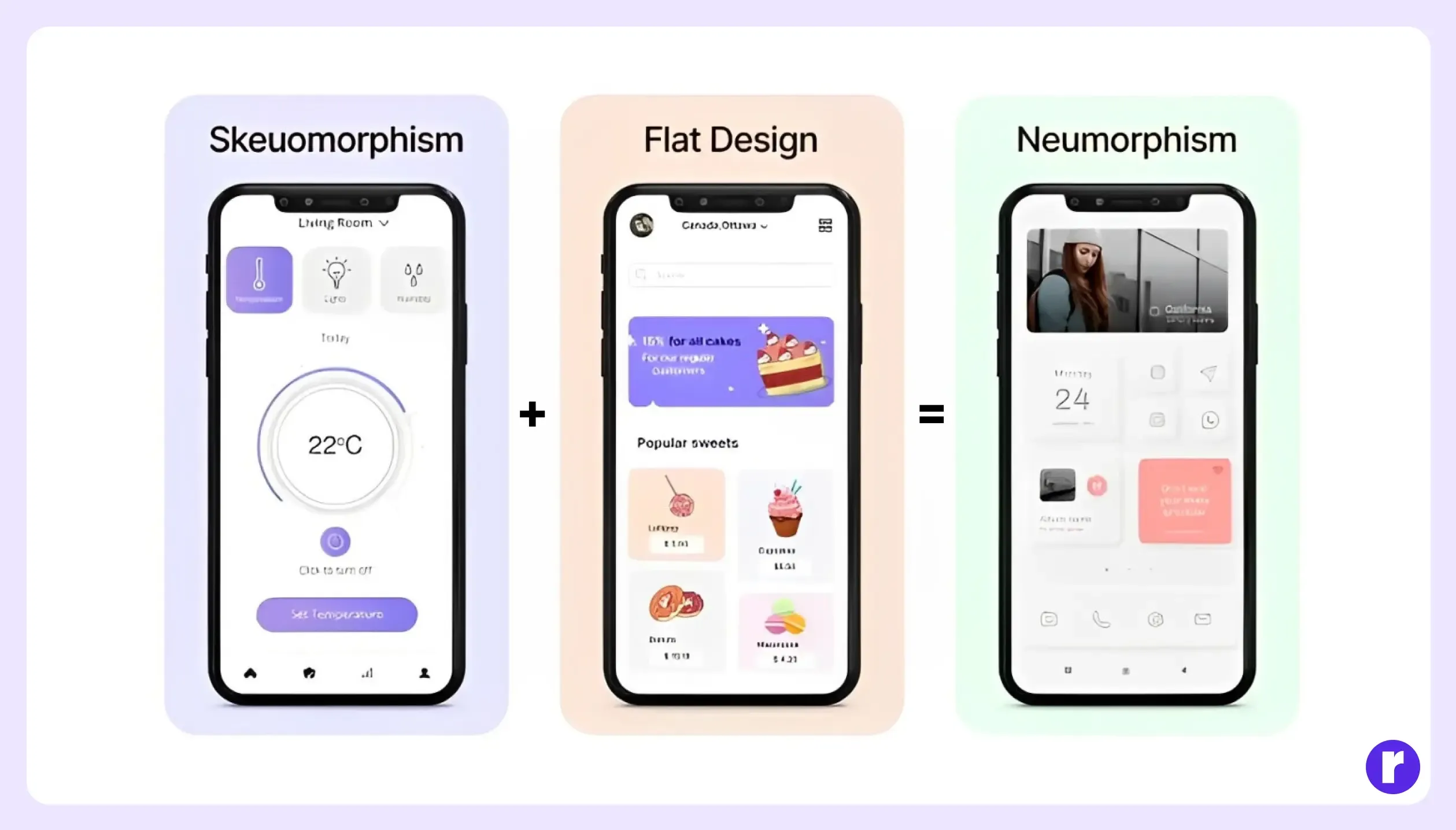
Skeumorphism + Flat Design = Neumorphism
- Neumorphism blends skeuomorphism (physical cues) with flat design (minimalism) for a modern, refined look.
- Subtle shadows and highlights create a sense of depth without clutter.
- Rounded corners and thin lines soften the design compared to sharp flat design.
- Generous white space keeps the interface open and inviting.
- Neumorphism uses blur, light, shadow, and geometry to sculpt a minimal aesthetic with depth and dimension.
- Neutral color palettes and clean design prioritize a smooth user experience.
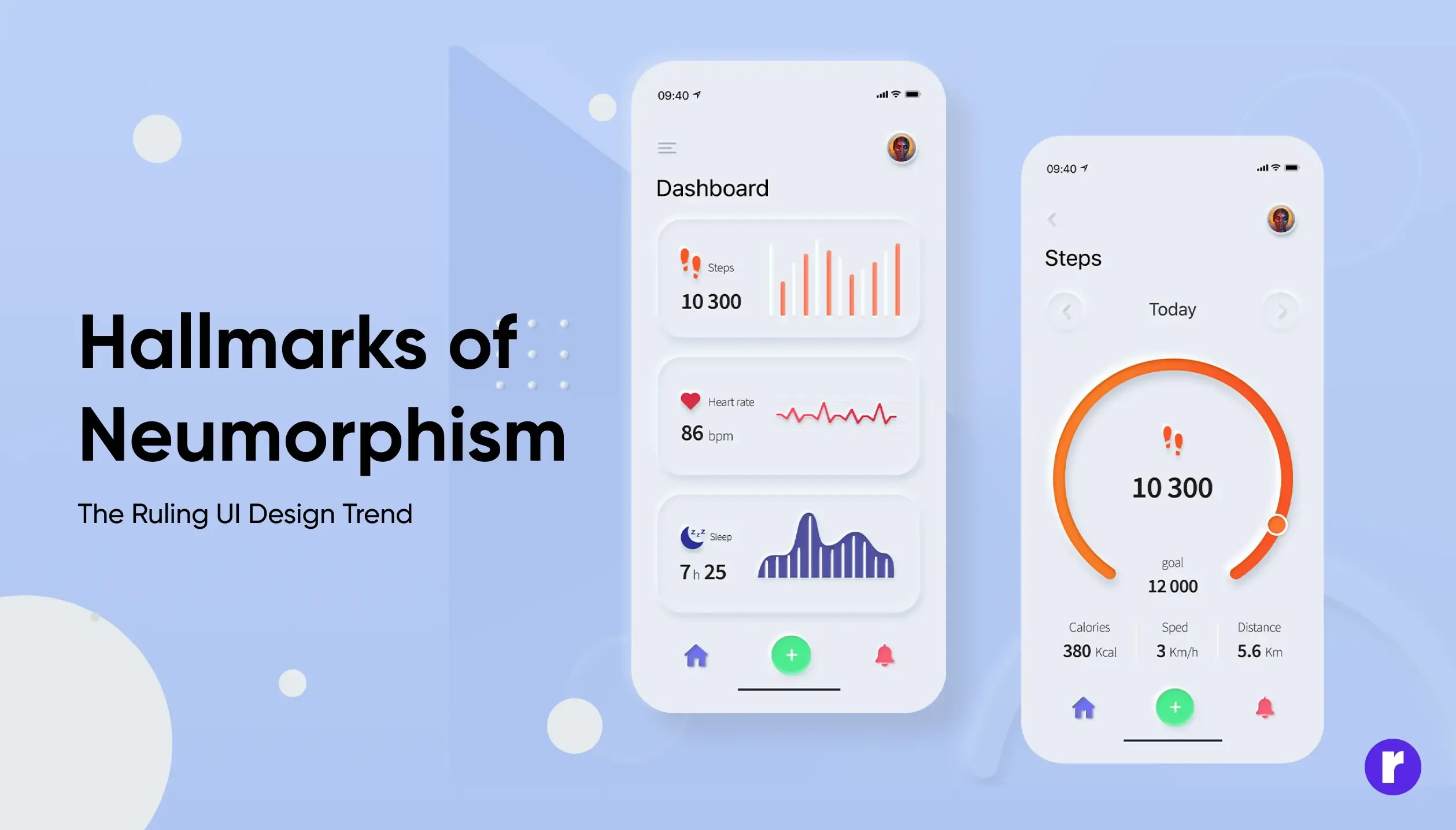
Hallmarks of Neumorphism:
- Soft Shadows and Highlights: Neumorphism departs from the flat design aesthetic by utilizing soft, diffused shadows and highlights. This creates a sense of depth and dimension, giving UI elements a sculpted, almost 3D-like appearance. Imagine buttons that appear slightly raised or indented, achieved through carefully placed shadows and blurs.
- Monochromatic Magic: Neumorphism often leans towards monochromatic color schemes. This means using different shades and tints of a single color to create a cohesive and balanced look. While grays are a common choice, designers can explore various color palettes as long as they maintain a subtle variation within the chosen hue.
- Minimalist at Heart: Despite the introduction of soft shadows, Neumorphism remains rooted in minimalism. It prioritizes clean lines, simple shapes, and an overall uncluttered aesthetic. This ensures that the soft 3D effects enhance the design without overwhelming the user with excessive details or decorations.
Benefits of Neumorphism:
- Intuitive Interaction: The subtle 3D effects in Neumorphism aren't purely decorative. They can actually improve usability. By making interactive elements like buttons stand out, users can more easily understand what's clickable and navigate the interface intuitively.
- Modern Elegance: Neumorphism strikes a perfect balance between minimalism and depth. The clean lines and soft 3D effects create a sleek and contemporary look. This can elevate the overall feel of your application or website, making it appear more sophisticated and polished.
- Adaptable Charm: Neumorphism isn't limited to a specific type of interface. The core principles can be adapted to various applications. Whether you're designing a mobile app, a web interface, or something else entirely, Neumorphism's versatility allows you to create a modern and engaging user experience.

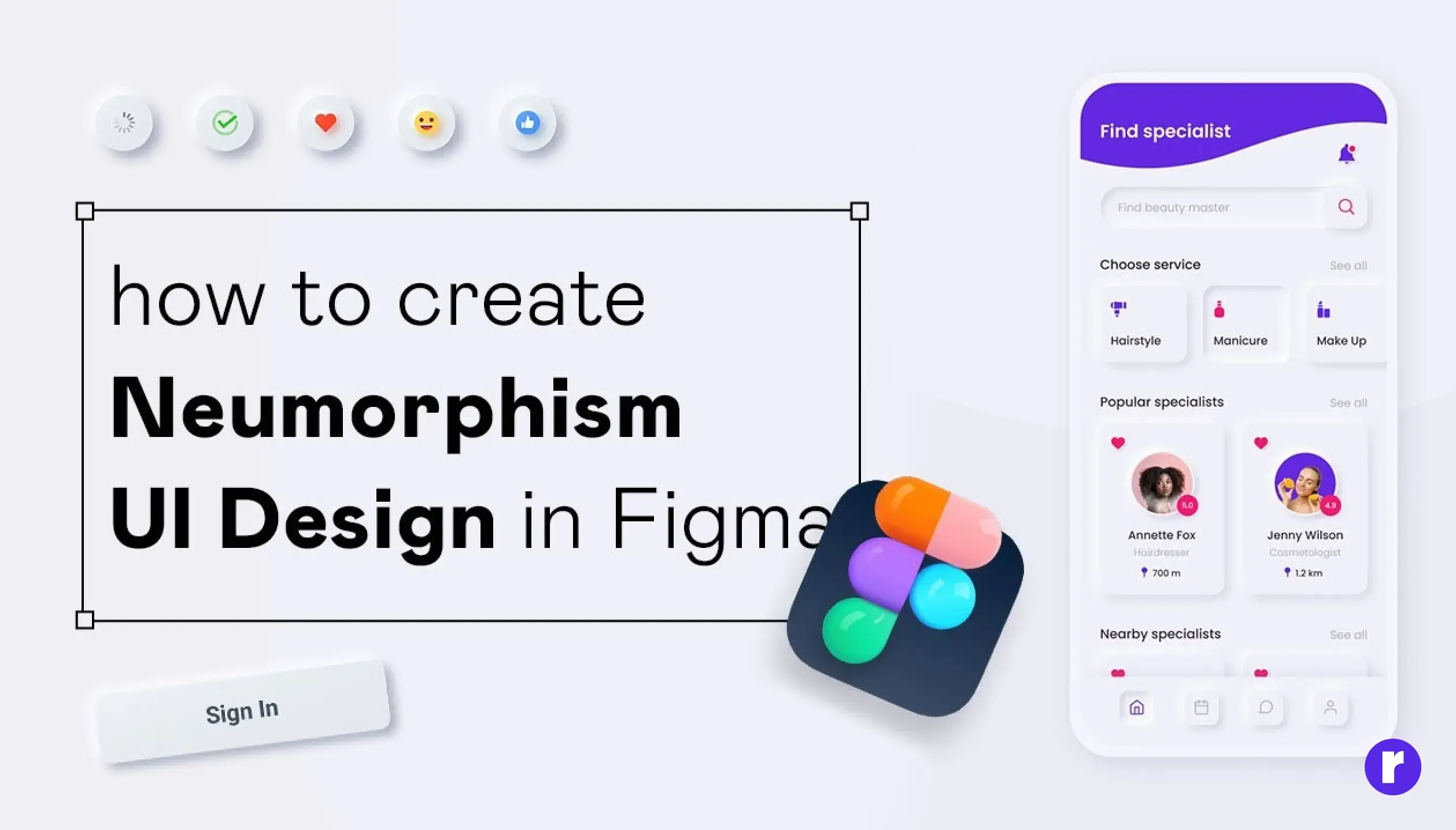
How to Create Neumorphism UI Design in Figma
Here's how to create a basic neumorphic element in Figma
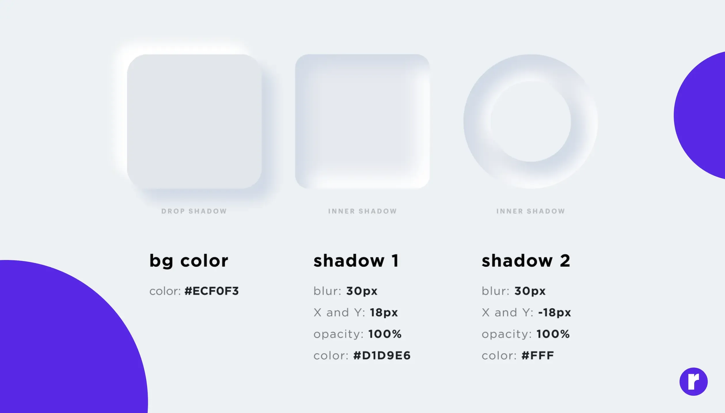
- Background & Shape: Set your desired background color and use the Shape Tool to create your UI element (e.g., button, card).
- Drop Shadow Magic: Add two drop shadows to the element. One with a dark color and "Multiply" blend mode to create a subtle indentation effect. Set its offset slightly down and to the right.
- Lighten Up: Add another drop shadow with a light color and "Normal" blend mode for a slight outward push. Offset it slightly up and to the left.
- Blur it Out: Apply a gentle blur to both shadows to achieve the soft, sculpted look. Adjust the blur strength and opacity to find the right balance.
Best Practices for Implementing Neumorphism:
- Balance Shadows and Highlights: Ensure that shadows and highlights are balanced to avoid making elements appear too flat or overly pronounced.
- Maintain Consistency: Use consistent shadow directions and intensities throughout the design to create a harmonious and coherent look.
- Accessibility Considerations: Pay attention to contrast and readability to ensure that the design is accessible to all users, including those with visual impairments.
Neumorphism Examples:
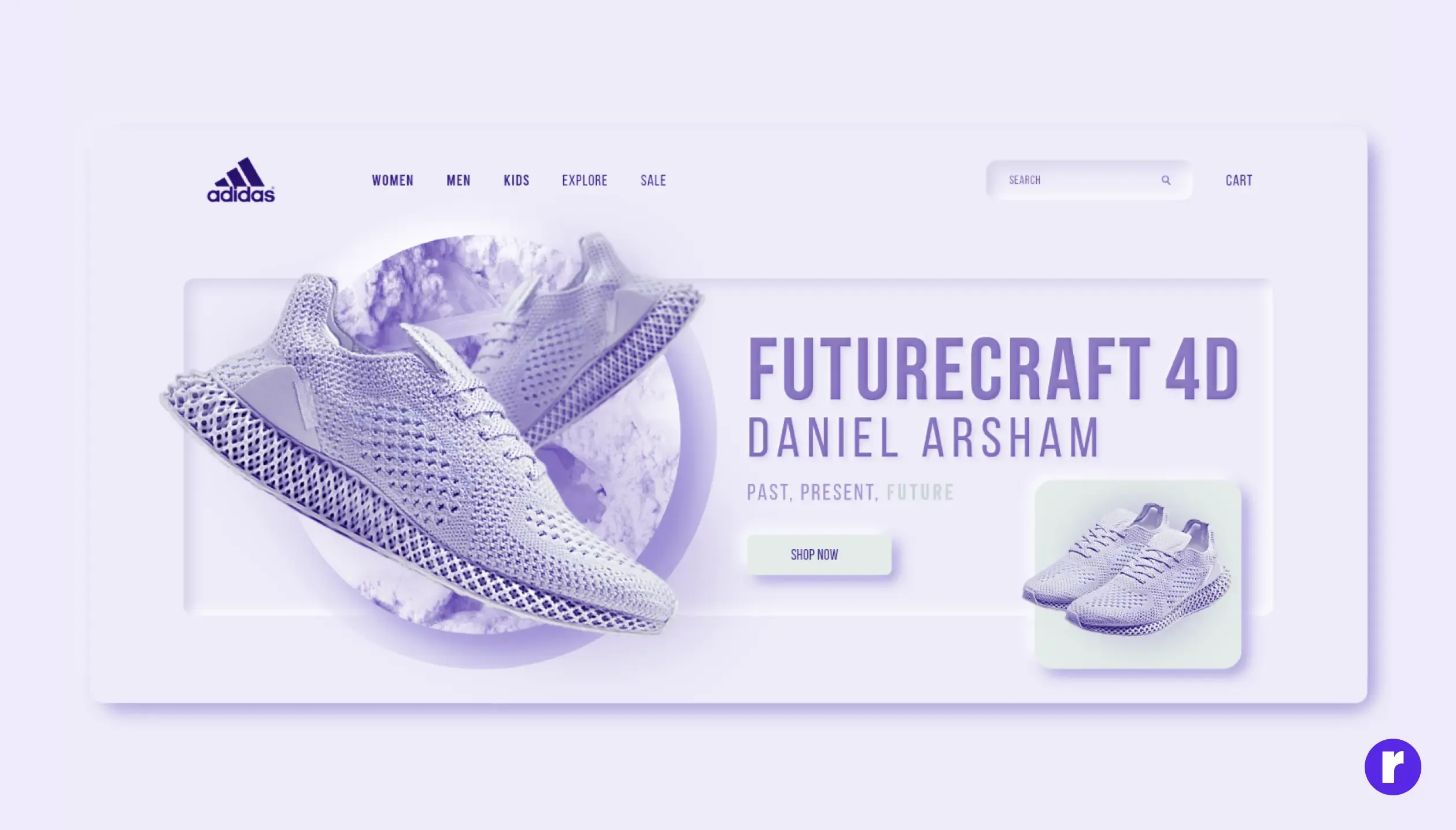
Neumorphism Landing Page
Neumorphism Logo
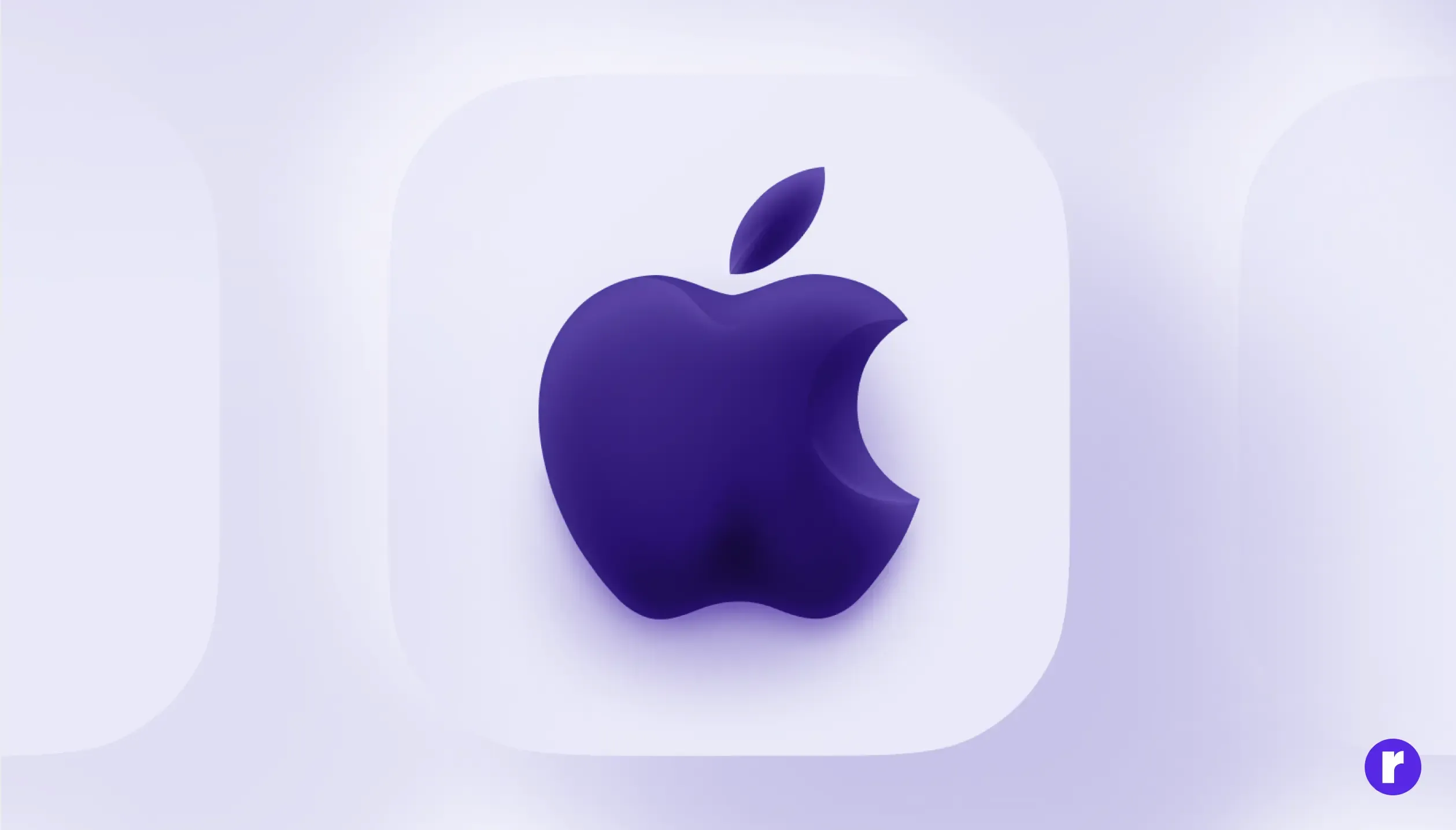
Neumorphism Icon Pack
Conclusion: The Future of Neumorphism
Neumorphism is a UI design trend that merges the best of both worlds: skeuomorphism's intuitive feel and flat design's clean minimalism. This results in visually appealing and user-friendly interfaces. It adds a touch of depth through subtle shadows and highlights, all while maintaining a clean aesthetic. As designers continue to explore and refine this approach, we can expect even more innovative applications of neumorphism to shape the future of UI design.
