Will an effective Typography design attract visitors?
Written by
Sumit Verma
UI/UX Designer

Ashu Sirswa
UI/UX Designer

Table of contents
Build with Radial Code
Share this
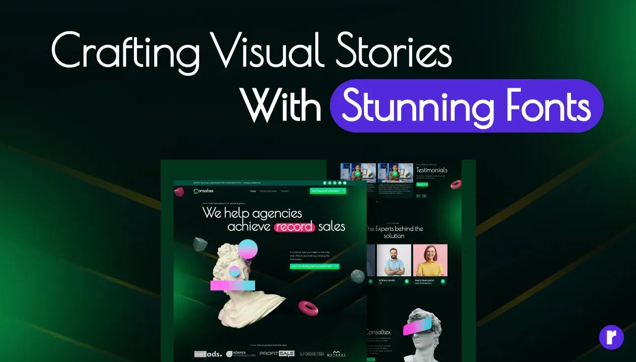
Website fonts play a crucial role in determining how easy or difficult it is for users to understand and enjoy a website. Excellent fonts capture and hold your attention, entice you to explore more pages, and pique your curiosity. Just compare how simple it is to understand these two photographs to see this in action.

In this blog post, we will discuss some tips for creating an effective typography design for your next project.
What is Typography?

Typography is the art and practice of organizing and creating text in a readable and visually pleasing way. Producing a logical and visually appealing layout involves choosing fonts, modifying spacing, and arranging characters. In many design aspects, including print materials, websites, and other visual communication media, typography is essential because it enhances the readability and impact of the information overall.
Why is Typography important?

UI designers or Graphic designers are visual communicators who express ideas using text, graphics, colors, and images. Typography is the element in graphic design that elevates textual messages. Below are a few notable instances of typography's ability to do more than only support textual content.
The impact of Typography on a reader

A reader's emotions and, consequently, their actions, can be influenced by your message when you choose the appropriate font selections. You can make sure that your material is communicated as effectively as possible and that visitors remain interested for the duration of their visit by investing a little more effort.
How fonts can be used to capture visitor's attention

Readability and legibility should always be considered. You want readers to be able to comprehend what they're reading with little to no effort on their part. To ensure that the on-page hierarchy flows properly, use the proper header tags (H1, H2, H3, etc.) and their matching font sizes for the page headings and smaller sizes for the body material. Make sure that every page of your website has the same size heading tag and body copy to maintain consistency.
Interested in Graphic design services for your project? Learn more.
Turning visitors into customers with strategic use of Typography

Through the use of typography, you may establish the proper tone and create a visual hierarchy that facilitates visitor navigation and helps them connect with your business. Customers are more engaged and are motivated to act as a result of all of this. By utilizing appropriate typefaces, sizes, spacing, and color combinations, you can create a polished and professional website that attracts visitors and encourages conversions.
How Font Choice Impacts Your Customers

It is possible to communicate ideas more successfully using fonts and font combinations than with words alone. Different fonts generate different feelings. For example, a friendly, flowing typeface will accomplish the desired effect of making your visitors feel at ease and at ease much more effectively than just urging them to "relax." (In any case, is it ever effective to tell someone to "relax"?)
- Choose your font wisely The readability and appearance can be greatly influenced by the typeface you use. Sans-serif typefaces, such as Arial and Verdana, are more modern and are frequently used in digital content, whereas serif fonts, like Times New Roman and Georgia, are more traditional and are typically used in print media.
- Use font hierarchy The arrangement of various font sizes, weights, and styles to produce a visual hierarchy of information is known as font hierarchy. This facilitates eye navigation and makes it simpler for the reader to skim and read the material.
- Increases accessibility
 Making deliberate use of the following typographic elements will adhere to accessible design rules and
increase the audience for your designs.
Making deliberate use of the following typographic elements will adhere to accessible design rules and
increase the audience for your designs.
- Line and letter spacing The vertical distance in a paragraph between lines of text is known as line spacing, and it has an impact on both reading and visual appeal. Text that is not crowded and has enough line spacing is easier for readers to follow.
- Font style
 Particularly in web design, simple, legible font choices make text easier to read for those with
disabilities or cognitive impairments. Sans serif fonts, such as Georgia or Times New Roman, are typically
less legible than sans serif typefaces, such as Arial, Helvetica, and Verdana.
Particularly in web design, simple, legible font choices make text easier to read for those with
disabilities or cognitive impairments. Sans serif fonts, such as Georgia or Times New Roman, are typically
less legible than sans serif typefaces, such as Arial, Helvetica, and Verdana.
- Text formatting Highlighting keywords or phrases with bold, italics, or underlining can assist people with cognitive difficulties in understanding a lot of content more easily.
- Use whitespace The empty space on your site that exists between various elements is called whitespace. It facilitates the visual division of content into various parts and improves reading and navigating through it.
- Use contrast
 Most people will find it difficult to read low-contrast color combinations, such as gray writing on a
light-colored background, especially those who have reading or visual impairments. A higher contrast would
be preferable, such as black writing on a white backdrop (or vice versa).
Most people will find it difficult to read low-contrast color combinations, such as gray writing on a
light-colored background, especially those who have reading or visual impairments. A higher contrast would
be preferable, such as black writing on a white backdrop (or vice versa).
- Limit the number of fonts Your site may appear cluttered and unprofessional if you use an excessive number of typefaces. Restrict the amount of typefaces you utilize to no more than two or three. For Example:

limiting the number of typefaces in your design to a select few that you use consistently. By ensuring that the different text parts in your design work well together, this strategy helps you maintain a tidy and solid appearance. It improves readability overall and gives off a more smooth, professional impression.
Conclusion
Finally, typography is a critical component of web design that has the power to significantly impact user experience. You can build an attractive typographic design for a website that will draw readers in and keep them interested by following to these easy rules. Recall to utilize good font selection, font hierarchy, spacing, and effective contrast while using fewer fonts.


