Best Practices for Building User-Friendly, Responsive Websites

Written by
Surender Singh
Front End Developer
Neha Rai
Front End Developer
Table of contents
Build with Radial Code
In today's digital era, the importance of developing a responsive web design cannot be overstated; it has transformed from being a choice to an essential requirement. With the wide range of devices and screen sizes used to access websites, it's crucial to ensure that your site looks and functions well on all of them. In this article, we'll explore some best practices for responsive web design that will help you deliver an optimal user experience on any device.
Mobile-First Approach
Begin with a mobile-first approach to prioritize essential content and features, ensuring simplicity and efficiency. This approach encourages simplicity and prioritizes the most critical content and features. As you scale up to larger screens, you can enhance the design without cluttering it.
Advantages of the Mobile-First Approach:
- Faster Loading: Mobile-first design often leads to faster loading times on all devices because it encourages a focus on essential content and performance optimization.
- Improved User Experience: Prioritizing mobile users ensures a seamless experience on smaller screens, where space is limited, resulting in a better experience for the majority of users.
- SEO Benefits: Search engines like Google prioritize mobile-friendly websites in their rankings, so a mobile-first approach can boost your site's visibility in search results.
Disadvantages of the Mobile-First Approach:
- Challenges for Complex Content: In cases where a site has complex, content-heavy desktop features, adapting them for mobile-first design can be challenging and may require trade-offs.
- Learning Curve: Teams accustomed to desktop-centric design may find it challenging to switch to a mobile-first mindset initially.
- Additional Development Time: Implementing a mobile-first approach might require additional development time and resources, particularly for redesigning existing desktop-focused websites.
Fluid Grid Layouts: Pros and Cons:
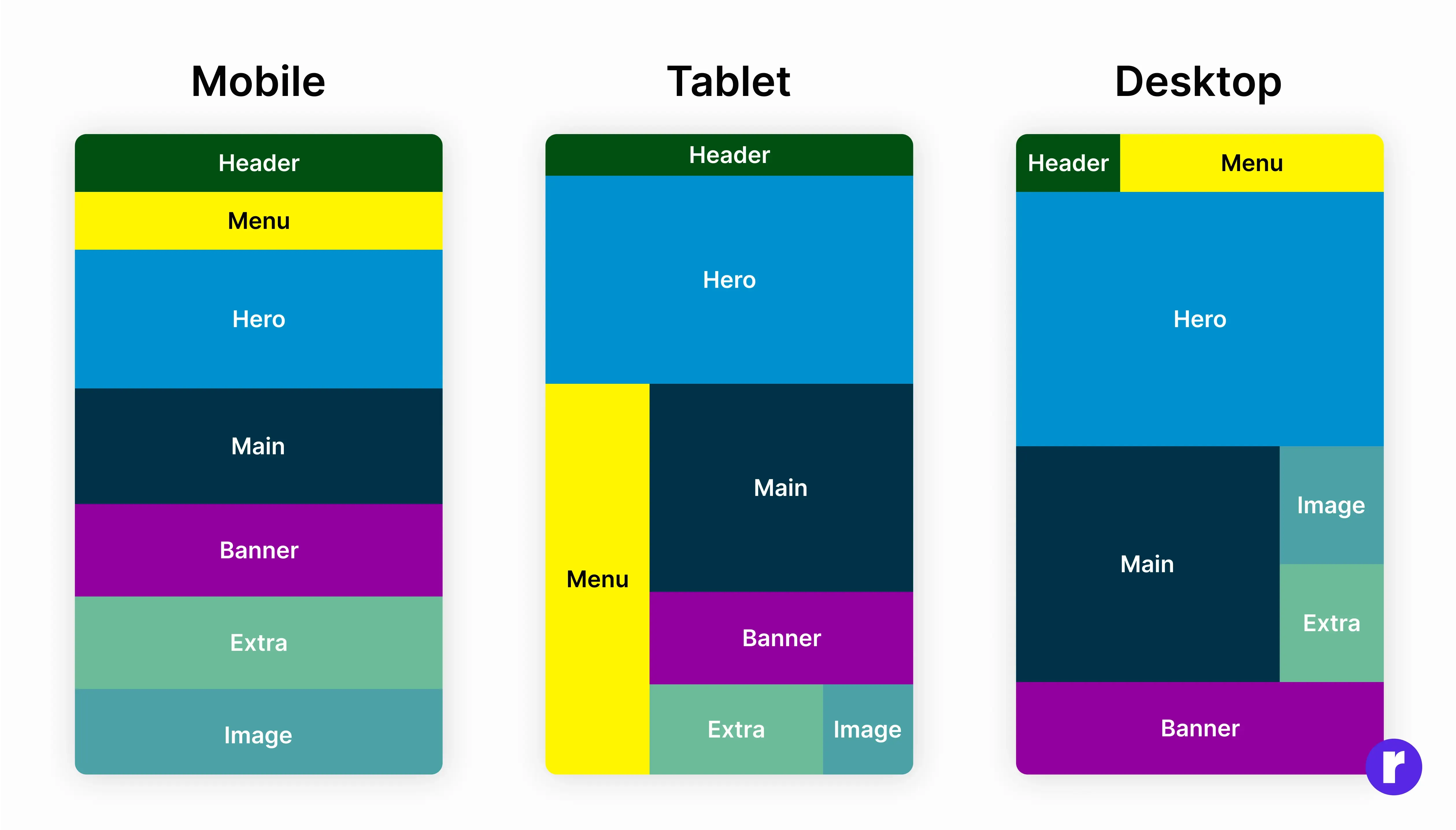
In the realm of web design, creating layouts that are not only visually appealing but also adaptable to various screen sizes is vital. Fluid grid layouts offer an intriguing solution, but like any design approach, they come with their own set of advantages and disadvantages. In this article, we'll dive into the world of fluid grid layouts and explore the pros and cons.
Advantages of Fluid Grid Layouts
- Embrace Seamless Responsiveness: Let fluid grid layouts effortlessly adapt to screen sizes, delivering a consistently smooth user experience across all devices. This adaptability is a fundamental advantage, as it ensures your website looks great on both desktop monitors and mobile devices.
- Improved Accessibility: Fluid layouts often lead to improved accessibility, as they accommodate users with different screen sizes and resolutions, including those with disabilities who may rely on larger text or different settings.
- Future-Proofing:By adopting fluid grids, your website is better equipped to handle the ever-changing landscape of devices and screen sizes. You won't need frequent redesigns to keep up with the latest technology.
Disadvantages of Fluid Grid Layouts
- Design Challenges: Creating a visually pleasing design that works well on both small and large screens can be challenging. Some designs may look great on a desktop but not translate effectively to smaller screens.
- Complex CSS: Implementing a fluid grid layout often requires more complex CSS code. You'll need to handle percentages and relative units, which can be trickier to work with compared to fixed measurements.
- Testing Complexity: Ensuring that your layout looks and functions well on a wide range of devices can be time-consuming. Testing across various screen sizes and browsers is crucial but may require additional effort.
Media Queries
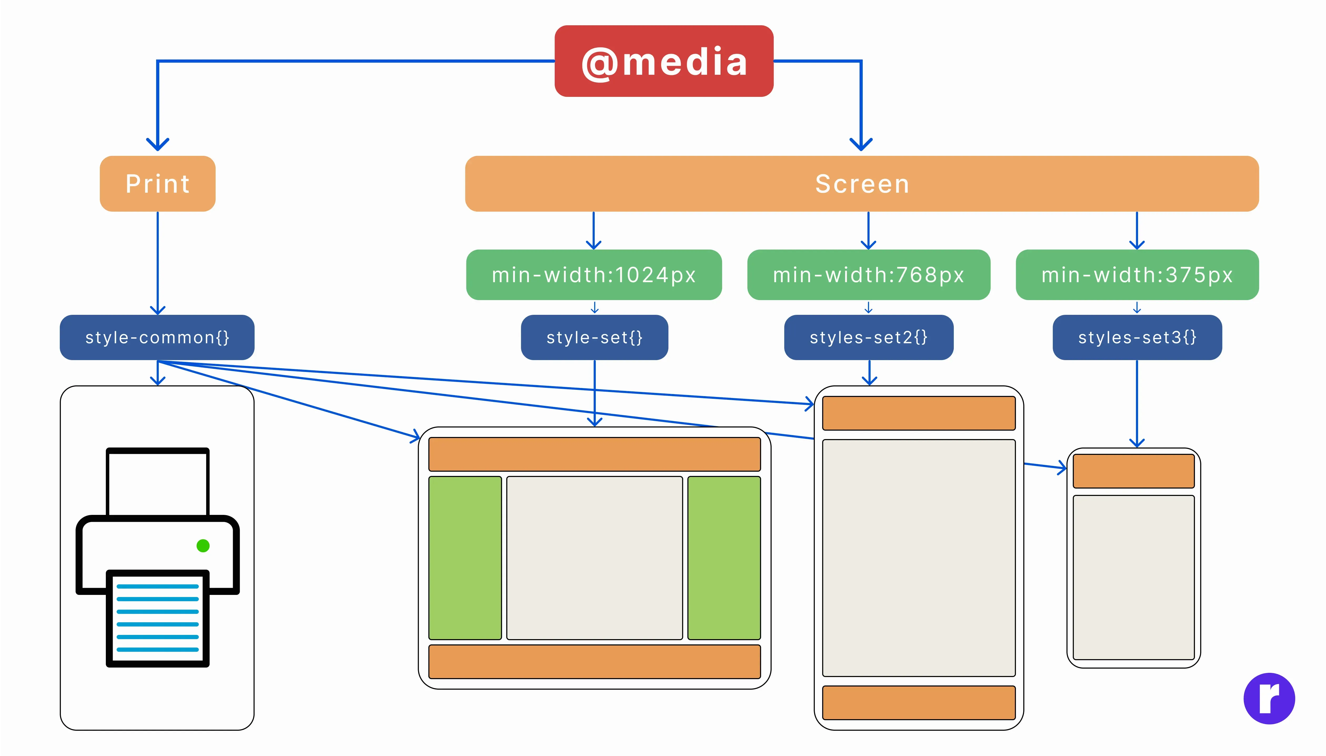
Leverage media queries to customize CSS styles based on device characteristics like screen width. Design breakpoints to adjust layout and content as the screen size increases or decrease.
Advantages of Media Queries
- Crafting Responsive Designs: Media queries are vital for building adaptable web layouts. They allow your website to adapt to different screen sizes and orientations, ensuring a consistent and user-friendly experience across various devices, from smartphones to desktop monitors.
- Improved User Experience: By tailoring the design and content based on the user's device, you can provide a more optimized and user-centric experience. For instance, you can display a simplified mobile menu on smaller screens for easier navigation.
- Cost-Efficient: Media queries can save development costs by eliminating the need to build separate websites or apps for different platforms. A single codebase can serve a wide range of devices, reducing maintenance overhead.
- Search Engine Optimization (SEO): Search Engine Optimization (SEO) is crucial for enhancing your website's visibility on search engines like Google. These search engines favor mobile-friendly websites, which means that implementing responsive designs using media queries can significantly boost your site's ranking in search results. By ensuring your website adapts seamlessly to various screen sizes, you not only improve user experience but also increase your chances of appearing higher in search engine rankings.
- Future-Proofing: Media queries are essential for ensuring your website's longevity. As new devices with varying screen sizes and resolutions emerge, responsive design remains effective and adaptable.
Disadvantages of Media Queries
- Complexity: Media queries can introduce complexity to your CSS, especially when dealing with multiple breakpoints and diverse device characteristics. This complexity may make your code harder to maintain and debug.
- Performance Overheads: Using overly complex media queries or excessive breakpoints can slow down page load times. It's important to find the right balance between responsiveness and performance.
- Testing Challenges: Testing a responsive design across different devices, screen sizes, and browsers can be time-consuming and challenging. Ensuring a consistent user experience on all platforms requires thorough testing.
- Learning Curve:For web designers and developers new to responsive design and media queries, there may be a learning curve. Understanding how to create effective and efficient queries takes time and practice.
- Specificity Issues: Managing CSS specificity within media queries can be tricky. The order of your media queries and the specificity of your rules can affect the display on different devices. Careful planning and organization are required.
- Limited Control: Responsive design using media queries may not always provide as much control over the layout as dedicated mobile apps or separate mobile sites. Some complex or unique design requirements may be more challenging to achieve.
Images Optimization

Use responsive images to prevent unnecessarily large file downloads on small screens. HTML's <img> tag with the srcset attribute or the <picture> element enables you to serve the right image for each device.
Advantages of Image Optimization
- Improved Page Load Times: Image optimization significantly reduces the file size of images without compromising quality. This leads to faster page load times, contributing to a better user experience and potentially improving search engine rankings.
- Bandwidth Savings: Smaller image sizes mean less data is transferred when users access your website. This can result in cost savings for both website owners and visitors, especially in regions with limited bandwidth.
- Better Mobile Experience: On mobile devices, where data speed and bandwidth can be limited, optimized images ensure smoother and faster loading of web pages, making the mobile experience more enjoyable.
- SEO Benefits:Search engines take into account page loading speed when determining search rankings. Faster-loading pages, thanks to image optimization, can improve your site's SEO performance.
- Enhanced User Retention: Users are more likely to stay on a website with fast-loading images. This can lead to lower bounce rates and heightened user engagement, fostering enhanced user retention.
Disadvantages of Image Optimization
- Loss of Quality: Over-optimization can lead to a noticeable loss of image quality. Striking the right balance between compression and quality is crucial but can be challenging.
- Time-Consuming: Optimizing images can be a time-consuming task, especially when dealing with a large number of images. It requires selecting the right compression settings for each image.
- Manual Work: Image optimization often requires manual intervention to ensure that images are correctly compressed and their aspect ratios are maintained. This can be tedious, especially for large websites.
- Compatibility Issues:Image formats and optimization techniques may not be universally supported across all browsers and devices. You may need to provide fallbacks or different image formats to ensure compatibility.
- Learning Curve: Understanding image formats, compression techniques, and optimization tools can have a steep learning curve for beginners. It may take time to become proficient in image optimization.
Typography
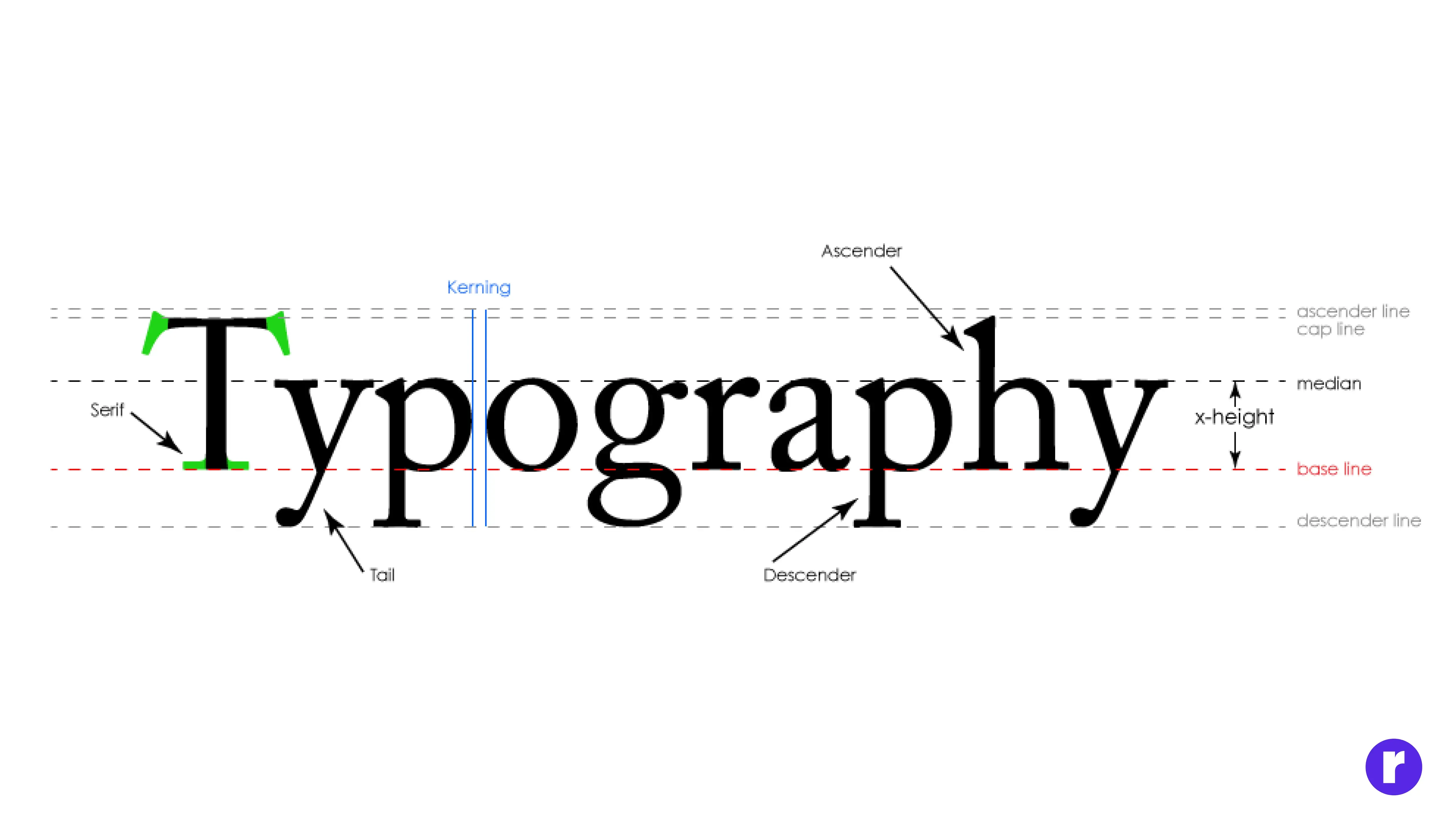
Choose a font size and line height that is legible on all devices. Avoid using fixed pixel values for fonts. Relative units like "em" or "rem" ensure scalability.
Advantages of Using Relative Units for Typography
- Scalability Advantage: Using relative units such as "em" and "rem" for font sizes and line heights ensures that text scales proportionally. This adaptability is crucial when users zoom in or out or when content is viewed on devices with different screen sizes and resolutions. As a result, text remains legible and accessible across various devices.
- Accessibility: Using relative units promotes better accessibility because users can adjust font sizes in their browsers if needed. This accommodates individuals with visual impairments or preferences for larger text.
- Consistency: Relative units contribute to consistent typography throughout your website. When you use "em" or "rem" changes made to the base font size apply uniformly to all elements, maintaining design cohesion.
- Easier Maintenance: Relative units simplify maintenance by allowing you to change the base font size in one place (typically in the CSS), affecting all text on the website. This reduces the need to manually adjust individual font sizes.
- Future-Proofing: As new devices with different screen sizes and resolutions emerge, websites using relative units are better prepared for the changing landscape of web typography, ensuring a consistent and user-friendly experience.
Disadvantages of Using Relative Units for Typography
- Initial Learning Curve: Working with relative units, especially if you're new to web design, may have a steeper learning curve compared to using fixed pixel values. You need to understand how they relate to the base font size.
- Potential for Unintended Scaling: In some cases, relying solely on relative units may lead to unexpected font size scaling if the hierarchy of HTML elements is not managed correctly. For example, nested elements may inherit multiple font size changes.
- Cross-Browser Compatibility: While support for relative units is widespread, there may be inconsistencies across browsers, particularly with less common units like "rem." It's important to test your typography on various browsers to ensure uniformity.
- Inherited Scaling: Relative units inherit scaling, which means if a parent element has a larger font size, it can impact the entire typography hierarchy. This can lead to unintentional changes in the design.
- Design Control: Relative units may limit fine-tuned control over typography. If you require pixel-perfect design, using fixed pixel values might be more suitable for certain elements.
Touch-Friendly Navigation
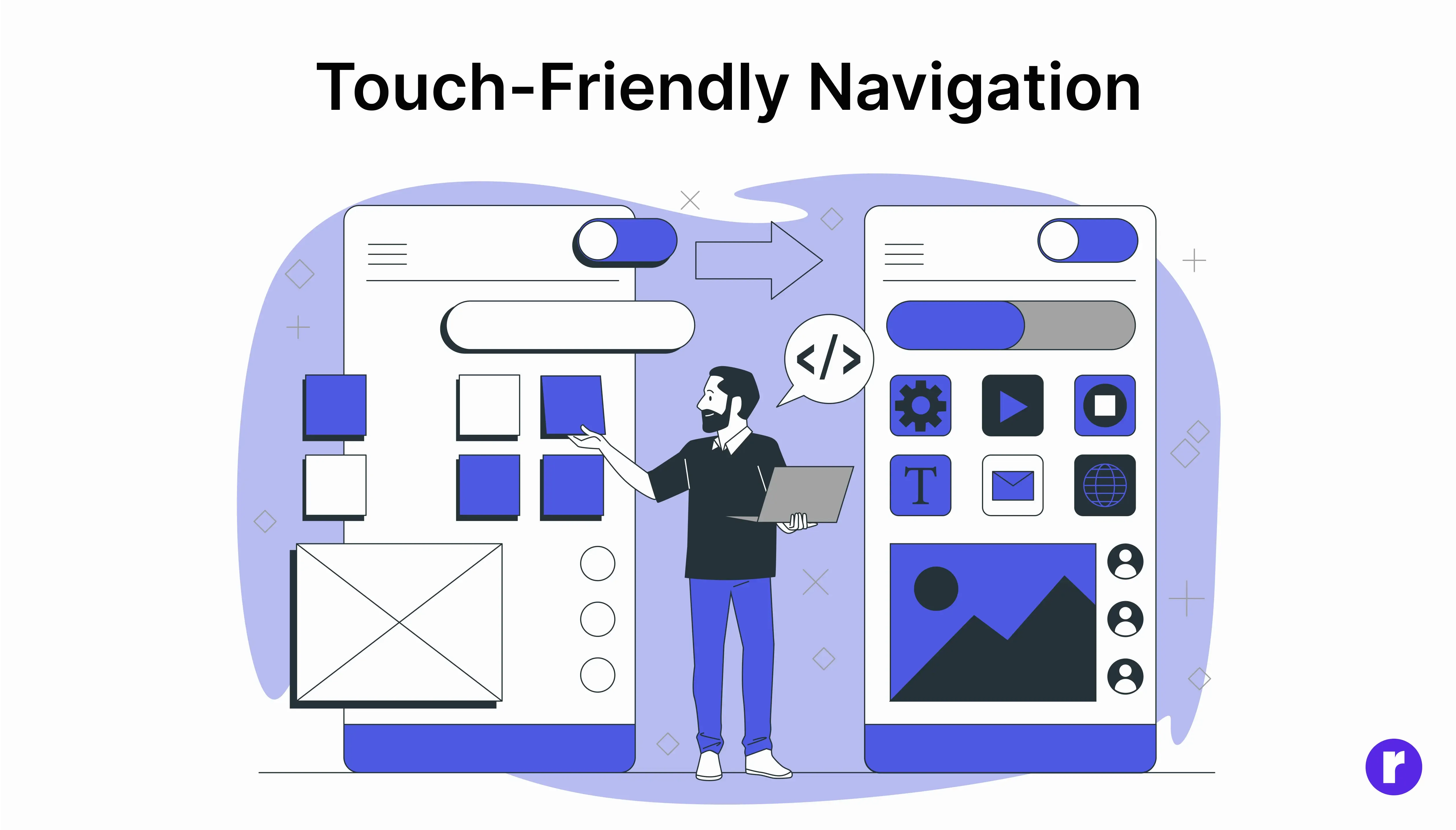
Craft navigation menus and buttons with touch-friendly interaction as a primary consideration. Use larger touch targets and consider the mobile user's experience.
- Responsive Design: Design your blog to be responsive, allowing it to adapt seamlessly to various screen sizes. This adaptability is essential for creating a touch-friendly navigation experience.
- Larger Fonts and Buttons: Implement larger fonts and buttons to enhance user interaction, making it easier to tap on links and navigate content. It's recommended to have a minimum touch target size of approximately 44x44 pixels for optimal usability.
- Hamburger Menu: Utilize a hamburger menu, symbolized by three horizontal lines, to offer a familiar and intuitive navigation solution. Tapping it reveals a navigation drawer or menu, a well-established pattern in mobile navigation design.
- Swipe-Up Menus: Implement swipe-up menus or cards that users can swipe up from the bottom or sides of the screen to reveal additional navigation options.
- Sticky Navigation: Design a sticky navigation menu that remains fixed at the top of the screen while users scroll. This approach ensures easy access to the menu at all times, eliminating the need for users to scroll back to the top.
Testing

Regularly test your design on various devices and browsers to ensure a consistent and smooth user experience. Consider using browser developer tools or dedicated testing tools like Browser Stack. For more insights, check out here
- Meta Tags: Meta titles and descriptions should be concise, descriptive, and contain relevant keywords to improve SEO. Use compelling language to attract clicks and clearly communicate what users will find on the page. Aim for a meta title under 60 characters and a description of around 150 characters for optimal display on search engines.
- Visual Content: Include high-quality, relevant images, videos, or graphics to enhance the visual appeal and provide additional context to your content. Ensure all visuals have alt text for accessibility, use appropriate file formats (e.g., WebP for images to optimize speed), and consider embedding videos or interactive elements that provide extra value without overwhelming page load.
- Links: Regularly test all internal and external links to prevent broken links that could harm SEO and user experience. Use descriptive anchor text that clearly indicates the link’s destination and consider adding nofollow tags to non-essential external links to keep SEO focused on primary content.
- Readability & Accessibility: Choose a clean, legible font with appropriate line height to enhance readability. Ensure there is sufficient color contrast between text and background to accommodate users with visual impairments. Support keyboard navigation, screen readers, and text resizing, adhering to WCAG (Web Content Accessibility Guidelines) standards for inclusive access.
- Mobile Responsiveness: Design for a mobile-first experience, ensuring that layout, buttons, and images resize and rearrange gracefully on smaller screens. Test across various devices and browsers to confirm that no critical information or functionality is lost, and avoid small touch targets that can frustrate mobile users.
- Loading Speed: Optimize page loading speed by compressing images, using lazy loading for media, and reducing file sizes for scripts and stylesheets. Use caching strategies and consider content delivery networks (CDNs) to serve resources faster. Fast-loading pages rank better and improve user satisfaction.
- User Feedback: Collect feedback through surveys, comments, or usability testing with actual users to gain insights into what works and what doesn’t. Feedback from colleagues or focus groups can help identify unclear information, distractions, or technical issues that impact user experience.
- Content Prioritization: Emphasize key content, especially for mobile users, by placing critical information higher on the page. Avoid heavy animations or non-essential elements that can impact page load and usability. Streamlined, accessible content improves readability and keeps users engaged.
- Responsive Design:Ensure your website uses responsive design, which adapts the layout and content to different screen sizes. This allows you to deliver a tailored experience for mobile users while preserving essential content.
- Maximize Image and Media Efficiency: Condense image and video files to minimize their size. Use mobile-friendly image formats like Webp. Consider lazy loading for images and videos to improve loading times.
- Minimize Non-Essential Elements: Identify any non-essential elements, such as large or complex animations, pop-ups, or excessive widgets. Limit or remove them on mobile versions of your webpage.

Conclusion
Responsive web design is not just a trend; it's a fundamental part of modern web development. Implementing these best practices will help you create websites that look and perform well on any device, providing an excellent user experience and potentially increasing your site's reach and impact.
Keep in mind that responsive web design is a continuous process. As technology and user habits evolve, it's essential to adapt and refine your designs to meet new challenges and opportunities.
Keep these practices in mind, and your websites will shine on screens big and small.
Feel free to customize and expand upon this content to make it unique and in line with your own writing style and website design.
