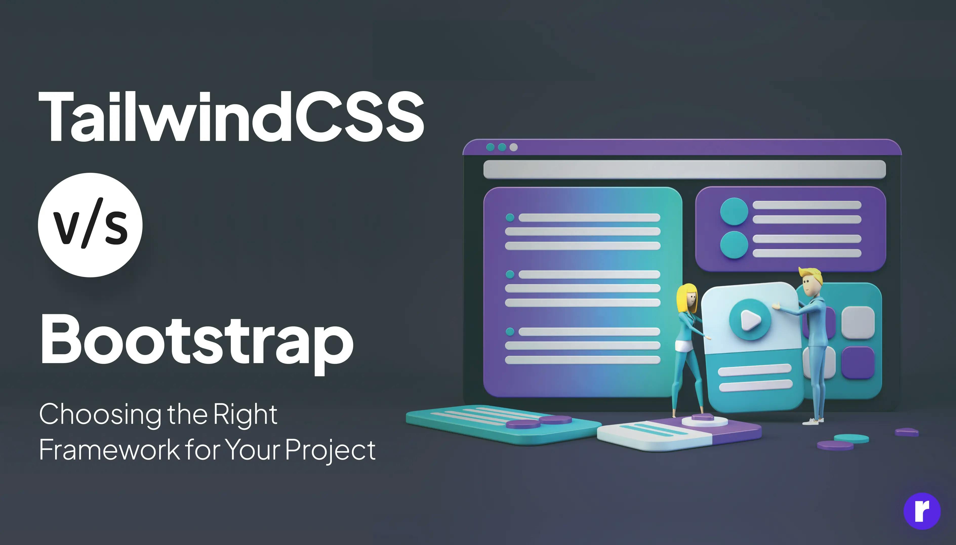
Tailwind CSS vs. Bootstrap: Choosing the Right Framework for Your Project
Written by
Preeti Yadav
Front End Developer

Kapil Dev
Front End Developer

Table of contents
Build with Radial Code
Share this
When you're building a website, picking the right tools can make your work much easier. Two popular choices are Tailwind CSS and Bootstrap. They're like the handy toolkits of web design, each packed with different gadgets to help you build cool sites. But which one should you choose? Let's dive in and compare them!
Tailwind CSS is like having a box of Lego bricks. It gives you the freedom to build whatever you want, however you want. You get utility classes that you can combine in endless ways to create unique designs. It's all about customization and control. With Tailwind, your website will stand out because no two sites look the same.
On the other hand, Bootstrap is like buying a furniture set. It comes with pre-designed components that you can use as they are or tweak a bit. It's great for getting a project up and running quickly, especially if you're okay with a design that looks a bit more standard. Bootstrap has been around longer, so it's got a large community and lots of resources.

Think about these points when picking one:
- Customization: Tailwind wins if you love detailed customization.
- Speed: Bootstrap might be faster for prototyping or if you prefer ready-made components.
- Learning Curve: Tailwind has a steeper learning curve, but once you get it, you have more control.
- Community and Resources: Bootstrap has a wider community, which can be helpful for beginners.
In the end, the choice depends on your project needs and personal preferences. Test both to see which one suits your workflow best!
What is Bootstrap?

Bootstrap, this essential and versatile tool in the world of web design can easily be compared to a Swiss army knife for its usefulness and flexibility. Since its introduction in 2011, it has established itself as a reference for its ready-to-use components. Think of it as a set of technical Lego pieces: with Bootstrap, you have a range of pre-designed parts - arms, legs, and even a head - just waiting to be assembled. Therefore, without having to dive into the complexities of code from the beginning, you can simply fit together these prefabricated elements, and, as if by magic, you get a robot, or in our context, a functional and aesthetically pleasing website. It is this simplicity and efficiency that make Bootstrap a preferred tool for so many web developers and designers around the world.
1. Pros of Bootstrap:
- Lots of Components: It has a ton of pre-made parts like buttons, forms, and navigation bars.
- Easy to Use: If you know a bit of HTML and CSS, you can start using Bootstrap quickly.
- Great for Beginners: It's perfect if you're just starting out and want to make something that looks good without being an expert.
2. Cons of Bootstrap:
- Looks the Same: Sometimes websites made with Bootstrap look too similar.
- Heavy Size: It can be a bit bulky, which might slow down your site if you don't need all its features.
How Does Bootstrap Help?
Bootstrap comes with a grid system built-in. It uses rows and columns to organize your webpage. You can think of it as a table, but way more flexible.
- Rows are horizontal groups where your content goes.
- Columns are vertical slices within those rows. They hold your text, images, or videos.
The cool part is that columns in Bootstrap automatically adjust their width based on the screen size. This means your website will look great whether it's on a phone or a computer.
Creating a Basic Grid
To create a grid, you start with a container. This is like the outer box that holds everything together. Inside this container, you add rows.
Here's a simple example:
<div class="container">
  <div class="row">
    <div class="col">
      Column 1
    </div>
    <div class="col">
      Column 2
    </div>
    <div class="col">
      Column 3
    </div>
  </div>
</div>
In this code, we have one row with three columns. On a big screen, they'll sit side by side. On a small screen, they'll stack on top of each other.
Customizing Columns
You can also tell Bootstrap how much space each column should take up. For example, if you want the first column to be wider, you can do this:
    <div class="col-md-4"> Column 1</div>
    <div class="col-md-4">Column 2</div>
    <div class="col-md-4">Column 3</div>
The "md" stands for "medium-sized screen." The number after it tells Bootstrap how many slots out of 12 total slots the column should take up. So, "col-md-4" means "use 4 slots."
Remember, practice makes perfect. Try making your own grids and see what you can create!
Pre-styled Components for Effortless Design Harmony: Bootstrap
Bootstrap is like a magic box full of tools that help you make websites look good without starting from scratch. It's a collection of pre-made design pieces that you can put together to create a website quickly and easily.
Why Use Bootstrap?
- Saves Time: Instead of writing lots of code to make a button or a menu, you can just pick one from Bootstrap.
- Consistency: All the pieces in Bootstrap match each other, so your site will have a unified look.
- Responsive: Bootstrap makes sure your website looks good on any screen size, automatically adjusting the layout.
- Customizable: Even though it comes with its own style, you can change it to fit your own design.
Key Features of Bootstrap
- Grid System: This helps you arrange your content in rows and columns that adjust to different screen sizes.
- Components: These are the building blocks of your website, like alerts, badges, and cards.
- JavaScript Plugins: These add interactive features to your site, like dropdown menus and slideshows.
- Utilities: These are helpful CSS classes that let you tweak spacing, size, and more without writing extra code.
Getting Started with Bootstrap
Bootstrap is a popular framework for building responsive websites quickly. Here's how you can get started step by step, with an example.
Step 1: Download Bootstrap
First, go to the Bootstrap website and download the latest version. You can choose to download the compiled CSS and JavaScript or use their CDN (Content Delivery Network) links.
Step 2: Set Up Your HTML File
Create a new HTML file and set up the basic structure. Include the Bootstrap CSS in the <head> section. If you're using the CDN, it will look like this:
<!DOCTYPE html>
<html lang="en">
  <head>
    <meta charset="UTF-8" />
    <meta http-equiv="X-UA-Compatible" content="IE=edge" />
    <meta name="viewport" content="width=device-width, initial-scale=1.0" />
    <title>Document</title>
        <!-- Bootstrap CSS -->
    <link rel="stylesheet" href="https://stackpath.bootstrapcdn.com/bootstrap/4.5.2/css/bootstrap.min.css">
  </head>
  <body></body>
</html>
Step 3: Add Bootstrap Components
Now you can start adding Bootstrap components to your page. Let's add a navigation bar as an example:
<nav class="navbar navbar-expand-lg navbar-light bg-light">
  <a class="navbar-brand" href="#">Navbar</a>
  <button class="navbar-toggler" type="button" data-toggle="collapse" data-target="#navbarNav" aria-controls="navbarNav" aria-expanded="false" aria-label="Toggle navigation">
    <span class="navbar-toggler-icon"></span>
  </button>
  <div class="collapse navbar-collapse" id="navbarNav">
    <ul class="navbar-nav">
      <li class="nav-item active">
        <a class="nav-link" href="#">Home <span class="sr-only">(current)</span></a>
      </li>
      <li class="nav-item">
        <a class="nav-link" href="#">Features</a>
      </li>
      <li class="nav-item">
        <a class="nav-link" href="#">Pricing</a>
      </li>
      <li class="nav-item">
        <a class="nav-link disabled" href="#" tabindex="-1" aria-disabled="true">Disabled</a>
      </li>
    </ul>
  </div>
</nav>
Step 4: Include Bootstrap JavaScript
At the end of your HTML file, before the closing </body> tag, include Bootstrap's JavaScript and its dependencies. If you're using the CDN, add these lines:
<!-- jQuery and Popper.js (Bootstrap's Dependencies) -->
<script src="https://code.jquery.com/jquery-3.5.1.slim.min.js"></script>
<script src="https://cdn.jsdelivr.net/npm/popper.js@1.9.3/dist/umd/popper.min.js"></script>

<!-- Bootstrap JS -->
<script src="https://stackpath.bootstrapcdn.com/bootstrap/4.5.2/js/bootstrap.min.js"></script>
Step 5: Customize Your Content
You can now add more content to your page and style it using Bootstrap's classes. For example, let's add a button:
<button type="button" class="btn btn-primary">Primary Button</button>
Step 6: Test Your Page
Save your HTML file and open it in a web browser to see your Bootstrap page in action. Resize the browser window to see how it responds to different screen sizes.
That's it! You've created a basic webpage using Bootstrap. From here, you can explore more components and layout options to build a complete and responsive website.
What is Tailwind CSS?

Tailwind CSS is a utility-first framework for fast and flexible web development, using utility classes instead of custom CSS. It's mobile-responsive and highly customizable to match brand styles.
Launched in 2017, Tailwind CSS adopts a utility-first mindset, favoring adaptable utilities over pre-made components, giving developers a "blank canvas" for unique designs rather than fixed patterns.
Tailwind enables developers to create unique interfaces for each project, offering design freedom comparable to building with Lego blocks. Its innovative approach has garnered popularity among developers eager to explore new design frontiers.
Pros of Tailwind CSS:
- Highly Customizable: You get to decide how each part of your site looks.
- Utility-First: This means you have lots of little helper classes to tweak your design.
- Less Bloat: Your website might load faster because you only use what you need.
Cons of Tailwind CSS:
- Steeper Learning Curve: It might take longer to learn because you're building more from scratch.
- More Code to Write: You'll be writing more classes in your HTML, which can get long.
Key Features of Tailwind CSS:

- Utility-First: Tailwind uses utility classes, which means you can style elements by adding pre-defined classes directly in your HTML. This makes it super easy to build and customize designs without writing custom CSS.
- Responsive Design: Tailwind is mobile-first and has built-in responsive modifiers. You can create different looks for various screen sizes just by adding simple class prefixes like md:, lg:, or xl: to your utility classes.
- Customization: With Tailwind, you can tweak the settings to suit your project's needs. You can change the default theme, colors, fonts, and more in the tailwind.config.js file.
- Component-Friendly: While Tailwind encourages a utility-first approach, it also supports component-based design. You can extract repeated utility patterns into reusable components.
- Plugin System: If Tailwind's default utilities aren't enough, you can extend it with plugins or even create your own. This allows for endless possibilities and additional functionality.
- PurgeCSS Integration: Tailwind integrates with PurgeCSS, which helps reduce the final size of your CSS by removing unused styles from your production files.
- Community and Ecosystem: There's a growing community around Tailwind CSS, offering plugins, tools, and UI kits to help speed up development and inspire new projects.
- Dark Mode Support: Tailwind CSS offers easy support for creating dark mode versions of websites. It makes adding dark mode styles to your design simpler.

Tailwind CSSTailwind CSS provides built-in support for implementing dark mode in web applications. The dark mode feature allows users to switch between light and dark color schemes based on their preferences. Here's a short description of Dark mode feature of Tailwind CSS
Getting Started with Tailwind CSS
Tailwind CSS is a tool-first framework for styling that lets you create designs right in your HTML. It's like having a huge set of building blocks for creating websites. Here's how you can get started:
Step 1: Set Up Your Project
First, make a new folder for your project on your computer. Inside this folder, you'll create your website files.
Step 2: Install Tailwind CSS
You can add Tailwind CSS to your project by using Node.js and npm (Node Package Manager). Open your command line or terminal and run the following command inside your project folder:
npm install tailwindcss
Step 3: Create Your CSS File
Make a new file named styles.css. At the top of this file, add these lines:
@tailwind base;
@tailwind components;
@tailwind utilities;
These lines tell Tailwind to include its styles into your CSS file.
Step 4: Process Your CSS with Tailwind
To turn your styles.css with Tailwind directives into a usable CSS file, run this command:
npx tailwindcss-cli build styles.css -o output.css
This will create an output.css file with all the Tailwind CSS styles ready to be used in your HTML.
Step 5: Include Tailwind in Your HTML
In the <head> section of your HTML file, link to the output.css file like this:
<link href="output.css" rel="stylesheet">
Now, you can start using Tailwind classes in your HTML to style your website.
Step 6: Start Building Your Site
With Tailwind CSS, you apply styling by adding utility classes directly to your HTML elements. For example:
<!DOCTYPE html>
<html lang="en">
  <head>
    <!-- Tailwind CSS -->
    <link href="https://unpkg.com/tailwindcss@^1.0/dist/tailwind.min.css" rel="stylesheet" />
    <title>Tailwind CSS</title>
  </head>
  <body style="background-color: gray;">
   <!--Card 1-->
	 <div class=" w-full lg:max-w-full lg:flex">
		 <div class="border-r border-b border-l
			border-gray-400 lg:border-l-0
			lg:border-t lg:border-gray-400 bg-white
			\rounded-b lg:rounded-b-none lg:rounded-r
			p-4 leading-normal">
			 <p class="text-gray-700 text-base">
				This Card is made using Tailwind CSS.
			 </p>
		 </div>
	 </div>
  </body>
</html>
Output:

This button will have a blue background, white text, bold font, padding, and rounded corners—all by using Tailwind's classes.
Step 7: Customize Tailwind
One of the best things about Tailwind is that you can customize it. You can change the default theme settings, add new utilities, and more by editing the tailwind.config.js file.
Step 8: Keep Learning and Experimenting
The more you use Tailwind CSS, the better you'll get at it. Check out the Tailwind CSS documentationTailwind CSS documentation for more information and tips on how to use it effectively.
Which One Should You Choose?
Choosing between Tailwind CSS and Bootstrap depends on your project and your style.
1. Go for Bootstrap if:
- You want to get a site up quickly with a design that's already polished.
- You're new to web design and want to learn with easy-to-understand components.
- You don't mind if your site looks a bit like others out there.
2. Pick Tailwind CSS if:
- You love having total control over your design and want to make something unique.
- You're okay with spending more time learning and building your site.
- You want a lightweight website that loads super fast.
Interested in development services for your project? Explore Radial Code today!
Bootstrap vs Tailwind CSS Comparison Table
Here's a detailed table comparing the features of Bootstrap and Tailwind CSS:
Feature |
Bootstrap |
Tailwind CSS |
Customization |
Customizable through Sass variables, but can be heavy with unused styles. |
Highly customizable by configuring the tailwind.config.js file. |
Learning Curve |
Easier for beginners due to ready-made components. |
Steeper learning curve as it requires understanding of utility classes and responsive design. |
File Size |
Larger default file size, which can be reduced by removing unused code with tools like PurgeCSS. |
Smaller initial file size that grows as you add more utility classes. |
Community & Support |
Large community, extensive documentation, and third-party plugins. |
Growing community, good documentation, and an increasing number of third-party plugins. |
Responsive Design |
Built-in responsive grid system and classes. |
Responsive design achieved through utility classes for different screen sizes. |
JavaScript Components |
Includes JavaScript plugins for interactive components like modals and carousels. |
No built-in JavaScript, but can integrate with other libraries or frameworks. |
Versioning |
Stable releases with version numbers. |
Uses semantic versioning with regular updates. |
Themes |
Offers themes but can look generic without customization. |
Encourages a unique design, less likely to look generic. |
CSS Methodology |
Follows traditional CSS practices with some BEM-like structure. |
Utility-first methodology, which encourages composing classes directly in the HTML markup. |
Popularity |
Very popular and widely adopted in the industry. |
Gaining popularity, especially among developers who prefer a utility-first approach. |
Documentation |
Comprehensive documentation with examples and templates. |
Detailed documentation with examples, but might require understanding of advanced CSS concepts. |
FAQs: Bootstrap vs Tailwind CSS
What is Bootstrap?
Bootstrap is a popular front-end framework that helps you design websites and web applications faster and easier. It comes with pre-designed components like buttons, forms, and navigation bars which you can use to build your site.
Is Bootstrap better than Tailwind CSS?
It depends on what you need. Bootstrap is great if you want to get a project up quickly with a design that looks good out of the box. Tailwind CSS is better if you want more control over the design and are willing to write more custom CSS.
Which one should I learn first?
If you're new to designing websites, Bootstrap might be easier to start with because of its ready-to-use components. If you already understand CSS well and want more design freedom, you might prefer Tailwind CSS.
Are there any big companies using Bootstrap or Tailwind CSS?
Yes, many large companies use these frameworks. For example, Twitter developed Bootstrap, and it's used by companies like Spotify and Lyft. Tailwind CSS is also gaining popularity and is used by companies like Twitch and Shopify.
Conclusion
Bootstrap offers a robust start for beginners with its pre-designed components and a proven ecosystem, ensuring reliability and efficiency. Tailwind CSS, however, offers a utility-first approach giving developers the freedom to create custom designs without excessive overrides, potentially leading to sleeker, more performative websites.
Consider your project's scale, customization level, and development speed when choosing between them. Experiment with both by building small projects to understand their syntax and philosophies better.
Ultimately, the choice between Tailwind CSS and Bootstrap is personal and project-specific. Some developers prefer Tailwind CSS's granular control, while others like Bootstrap's ready-to-use setup. Both frameworks excel in their ways, enabling the creation of beautiful websites. Happy coding! 🎉


